

What is a slider control?

A slider control is used to reflect the change effect of certain numerical values and status adjustments by sliding the slider, and can be used in conjunction with text controls. This routine introduces common applications of slider controls, and describes the configuration of each application in conjunction with the screen in engineering projects. Common applications are as follows:
- Brightness adjustment function: Implement the adjustment of screen brightness through the slider while changing the associated text control value.
Scope of application: Full series.
Routine download link: "<Slider Control Application>" (click to jump)
5.1 Introduction to slider control properties
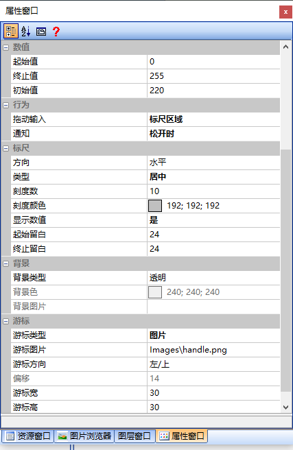
This section focuses on the properties of the slider control. The property window is shown as follows:
Start value
The value indicated when the slider control cursor is at the starting position.
End value
The value indicated by the slider control cursor at the end position
Initial value
The default value indicated by the cursor upon initialization
Drag input
Set the drag input method for the cursor, as shown below
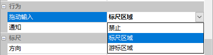
Disable
Set the cursor to be disabled for dragging
Ruler area
The cursor can only be dragged within the ruler area
Cursor area
The cursor can only be dragged within the cursor area
Notification
When dragging or after dragging the cursor, the data sent to the corresponding screen can be set to notify the data sending method as "When dragging" or "When released"
Direction
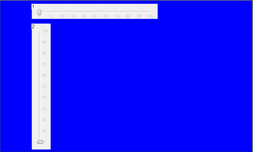
Set the direction of the ruler to "Horizontal" or "Vertical", as shown below
Type
Set the position of the cursor in the ruler area, with options of "Offset" or "Centered" display
Scale Count
The number of scales on the ruler
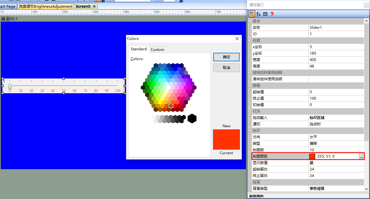
Scale Color
Set the color of the scales, as shown below
Display Value
Set whether to display the scale values on the ruler
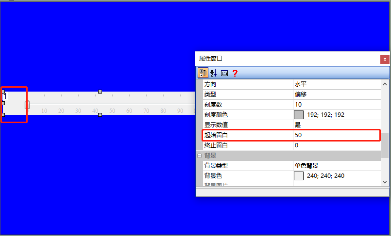
Starting Blank
The distance from the starting position of the ruler to the edge, for example, set to "50", the effect is shown as follows
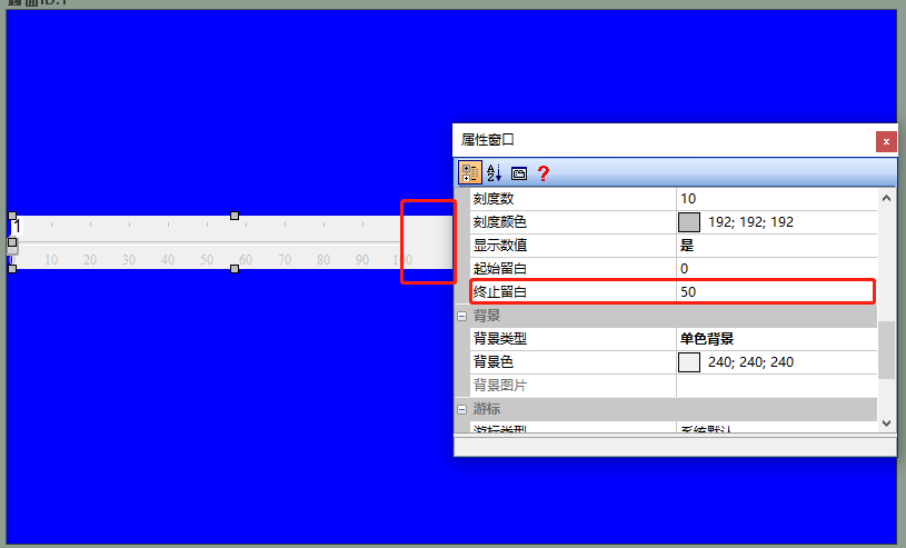
End margin
The distance from the ending position of the ruler to the edge, for example, set to "50", the effect is shown as follows
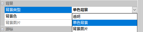
Background
Set the color and type of the ruler background. The background can be set to "Transparent", "Single-color background", or "Background image" as shown below
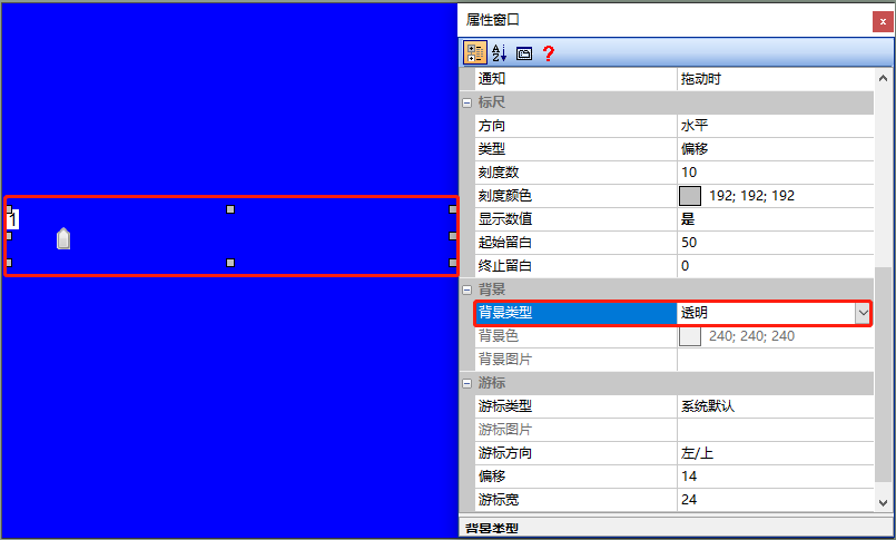
Transparent
Set the ruler background to be transparent, leaving only the cursor, as shown below
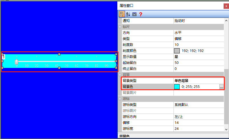
Single-color background
Set the ruler background to a single color, as shown below
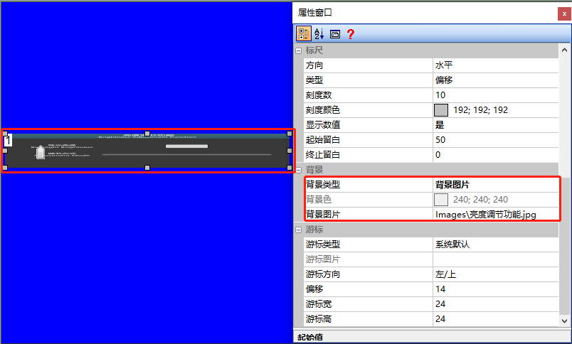
Background image
Set a custom image UI as the background of the ruler, as shown below
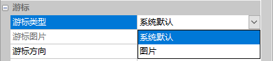
Cursor
The cursor can be set to "System Default" or "Image", as shown below
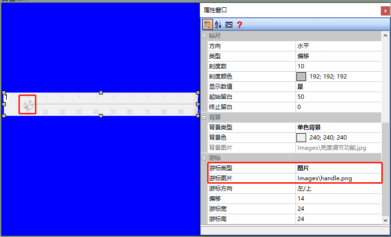
Cursor Type
The cursor can be set to "System Default" or "Image". When selecting "Image", a pre-prepared image UI needs to be inserted, and the effect is as follows
Cursor Direction
Sets the display position of the cursor in the vertical direction of the ruler scale
Offset
Sets the offset distance of the cursor on the ruler
Cursor Width
Sets the width of the cursor
Cursor Height
Sets the height of the cursor
5.2 Brightness Adjustment Function
[Brightness Adjustment Function] This screen introduces how users can configure the basic properties and usage of the slider control. (To demonstrate the usage effect, the example routine uses the slider control in conjunction with the progress bar control. Please refer to the [Progress Bar Control Application] document for usage instructions.)
Screen Configuration
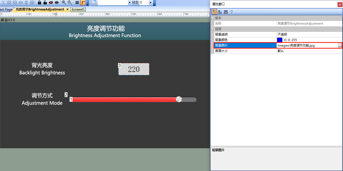
Import the corresponding artwork image for the "Background Image" in the "Brightness Adjustment Function" screen. Add text controls, progress bar controls, and slider controls to this screen, as shown below
Property Configuration
Text Control
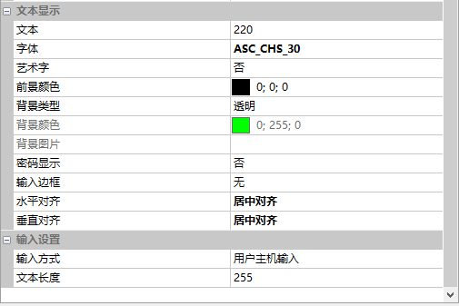
The property configuration of the text control is shown below.
Progress Bar Control
The property configuration of the progress bar control is shown below.
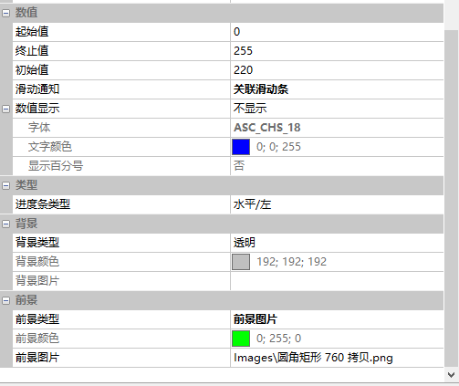
Note: When using the progress bar control in conjunction with the slider control, the ID of the progress bar control must be adjacent and continuous to the ID of the slider control, and the ID of the progress bar control must be less than that of the slider control. Only then can the two be used in conjunction. In the example routine, the ID of the progress bar control is "1" and the ID of the slider control is "2".
Slider Control
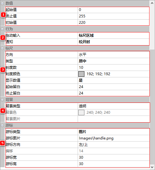
- Set the [Termination Value] to "255" and the [Initial Value] to "220"
- [Notice] For "when released"
- The "Type" is "Centered"
- The "Background Type" is "Transparent"
- The 'Slider Type' is set to 'Image', the 'Slider Image' field is used to insert an image UI, the 'Slider Width' is set to '30', and the 'Slider Height' is set to '30'. The configuration is shown below
Run Preview
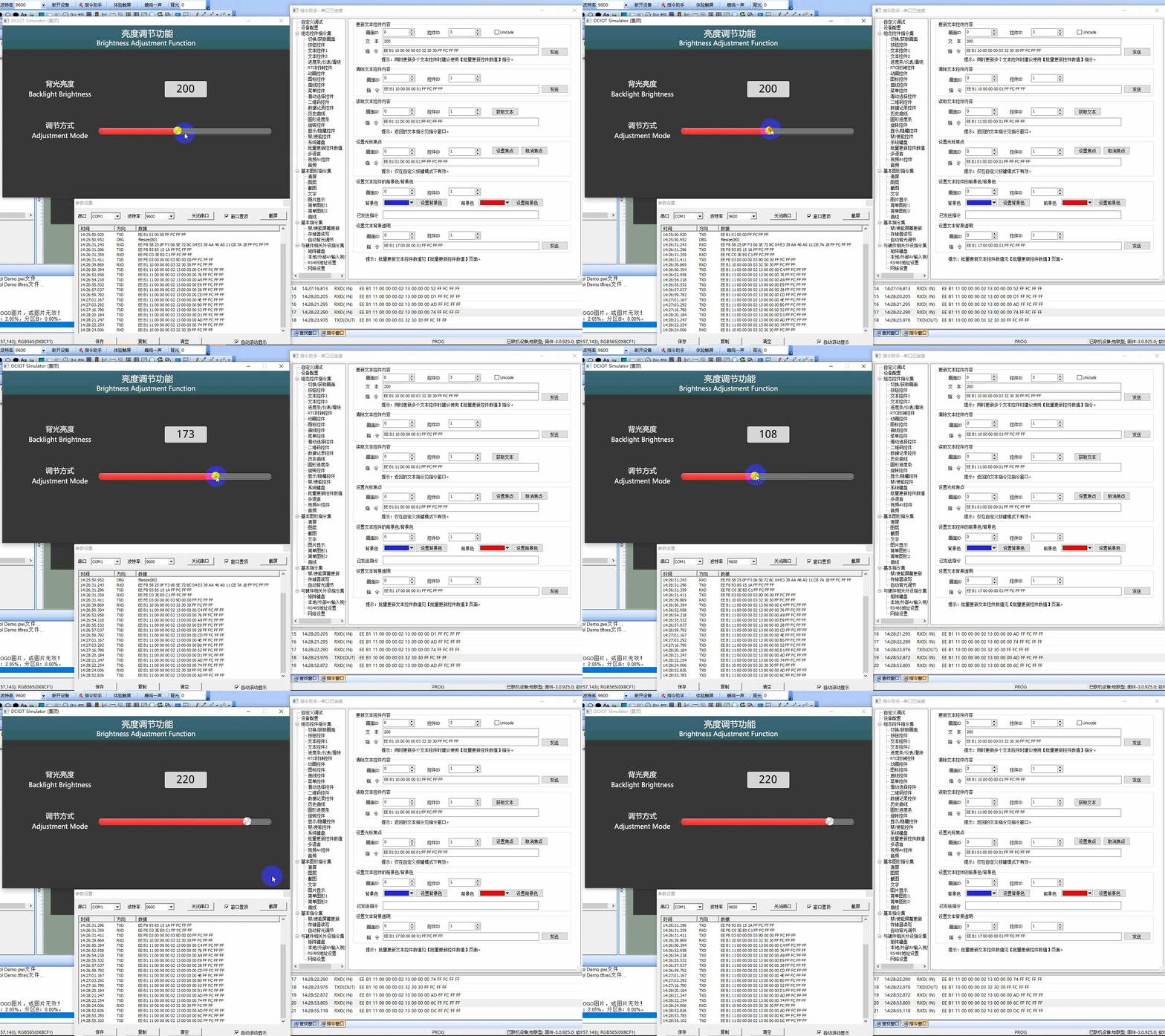
When running the virtual screen, users can simultaneously change the values of the progress bar controls by dragging the slider cursor on the virtual screen with a mouse (the value of the text control [Backlight Brightness] needs to be controlled and changed through external MCU, which will be described in detail below). At the same time, the VisualTFT software and the virtual screen can be connected using a "virtual serial port". Open the [Command Assistant], select the [Progress Bar Meter Slider] on the left navigation bar, set the command parameters for "updating the progress bar meter slider", and the display effect is as follows:
External MCU Control
Refer to the function declaration in the him.dever.h file and the definition in the him.dever.c file in the Keil development package.
Use the MCU to set and update the slider value
For example, if the user needs to implement a slider control with a range of [0-255], and the cursor is displayed at the position of "88", the value of the text control [Backlight Brightness] is simultaneously updated to "88". Simply call the slider control value update function SetSliderValue() as shown in the code below
/************************************************************************

** Function name: void SetSelectorValue (uint16 screen_id,
**                                       uint16 control_id,
**                                       uint8 item);
** Descriptions    : 设置滑动选择控件值
** input parameters: screen_id: 画面ID
**                  control_id: 控件ID
**                        item: 设置的选项
** output parameters: 无
** Returned value   : 无
************************************************************************/
{
   ……
    SetSelectorValue (0, 1, 2) //画面ID0,控件ID1,设置的选项第三项
    ……
}

Leave a Reply