
What is a button control?
A button control can be set to either an up or pressed state.
The background of the control can be set to a single color or a picture, allowing the actual button press effect to be visible when pressed.
The button control can also implement various functions, such as long press, transition, setting, etc.
This section introduces the basic attributes and common applications of the button control, combining the screen in the project to introduce the configuration of each application. Common applications are as follows:
Button switch function:
Implementing transition, switch, setting, reset, long press, and delay functions
Button logic function:
Implementing mutual exclusion between two buttons and using instructions to achieve a master switch function
Single button with multiple states:
Using a single button and an icon to achieve the function of a multi-state button
Button disable and enable:
Using the delay function of buttons to disable and enable other buttons
Custom command:
Send a custom command when a button is pressed
1.1 Attribute introduction
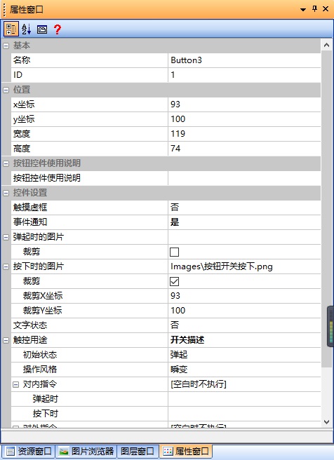
This section focuses on the attributes of the button control, as shown in the attribute window below
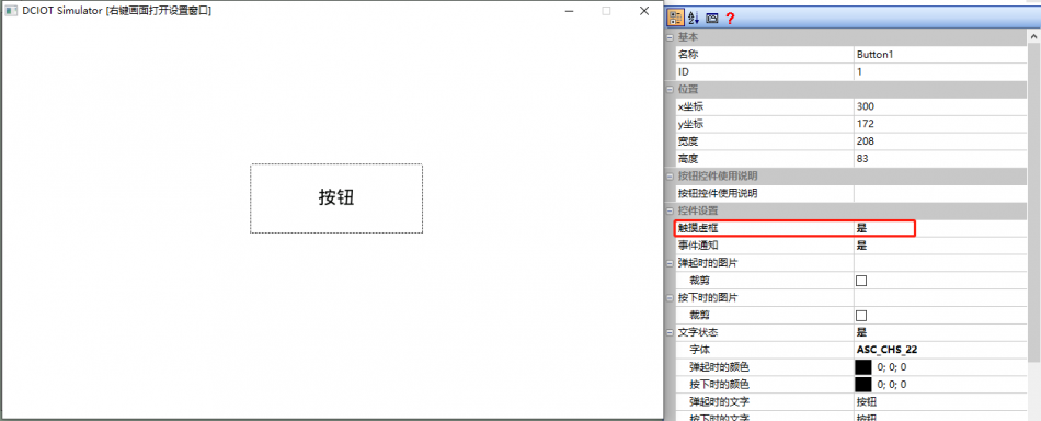
Touching the dotted box
When the user presses the button, a dotted box is displayed, as shown below:
Event notification
When the button state changes, upload a notification.
(Note that if button notifications are turned off, the minic script and Lua script corresponding to the button will not trigger callbacks, and no commands will be sent through the serial port)
Image when popped up
The image displayed when the button is in the popped-up state. When "Crop" is checked, the image of the area corresponding to the button coordinates in the image will be displayed
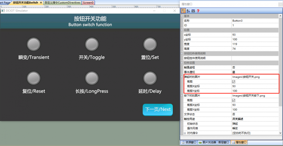
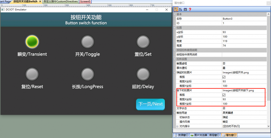
Image when pressed
Image displayed when the button is pressed. When "Crop" is checked, the image of the area corresponding to the button coordinates in the image will be displayed
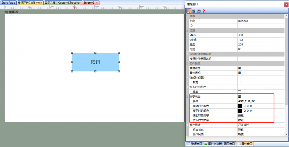
Text status
Display text on the button control. Select "Yes" to display text by status, as shown below
- Font: Text size and style
- Color when popped up, color when pressed: Text color
- Text when popped up, text when pressed: Text displayed in two different states
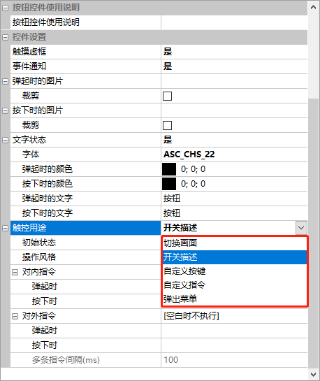
Touch purpose
- Switch screen
- Switch description
- Custom button
- Custom command
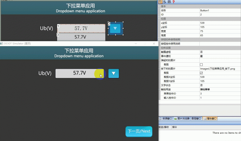
- Pop-up menu
is shown in the figure:
Switch screen
to a specified screen. The relevant parameter configuration is as follows:
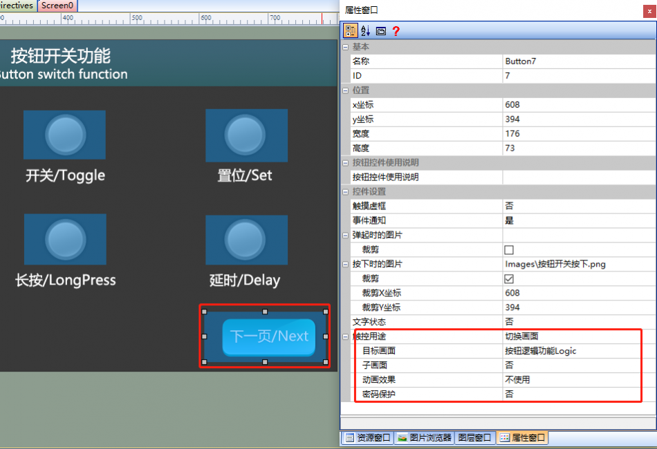
Optional functions include:
- Target screen: When clicking the button control, switch to the specified screen
- Sub-screen: The sub-screen is generally a small window with a transparent background, which can be used as a dialog box. Set the 'Background Transparency' of the target page to 'Transparent', and set up a picture control in the page. Select the corresponding UI for the 'Path' of the picture control. The display effect is as follows:
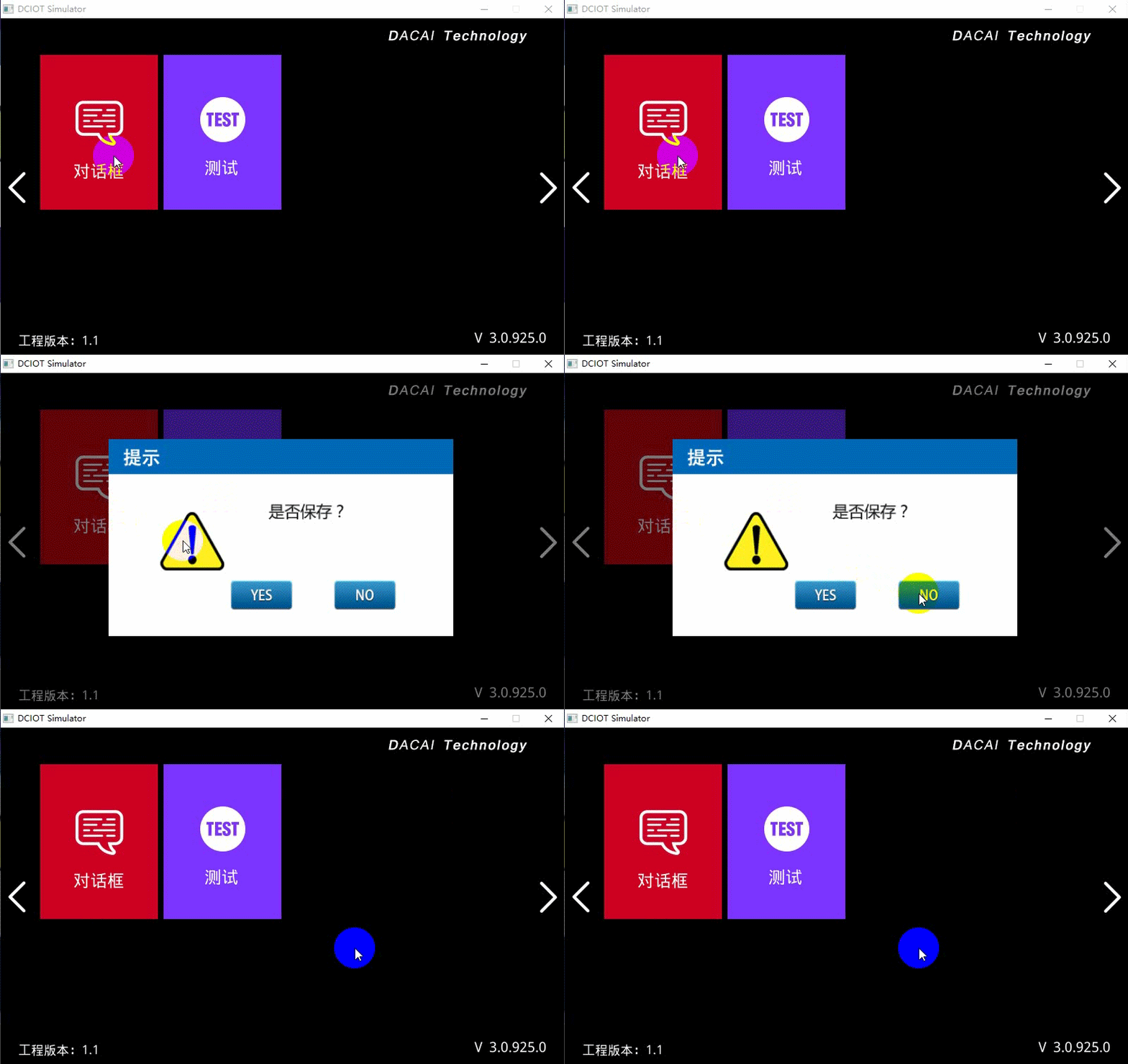
- Animation effect: The transition effect when switching pages, which can be selected from left to right, top to bottom, fade-in/fade-out, gradually opening, etc. This function is only supported by IoT models
- Animation range: Display the animation effect within a specified range, and do not display outside the specified range. You can set the entire screen or a specified range
- Password protection: After enabling password protection, you need to enter the correct password to switch the screen
Switch description
The function of the button switch, and the relevant parameter configuration is as follows:
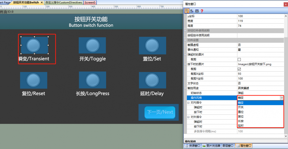
Optional functions include:
- Initial state: The initial state of the switch.
- Operation style:
- Transient: After being released, the switch automatically pops up, similar to a touch switch function.
- Switch: After being pressed, the switch changes from popped up to pressed or from pressed to popped up, similar to a lockable switch function.
- Set: The switch can only change from popped up to pressed.
- Reset: The switch can only change from pressed to popped up.
- Long press: Similar to the transient button, but notifies every 100 milliseconds during pressing.
- Delay: Notifies after pressing for a specified length of time.
- Internal command: The command executed internally after being pressed or popped up.
- External command: The command sent externally after being pressed or popped up.
Custom button
Convert the corresponding button into a value input. It needs to be used in conjunction with a text control for custom keyboard input. The button control can be designed as a custom keyboard, and users need to treat the button control as a custom key.
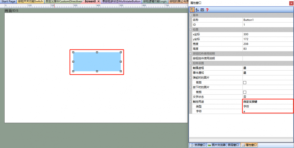
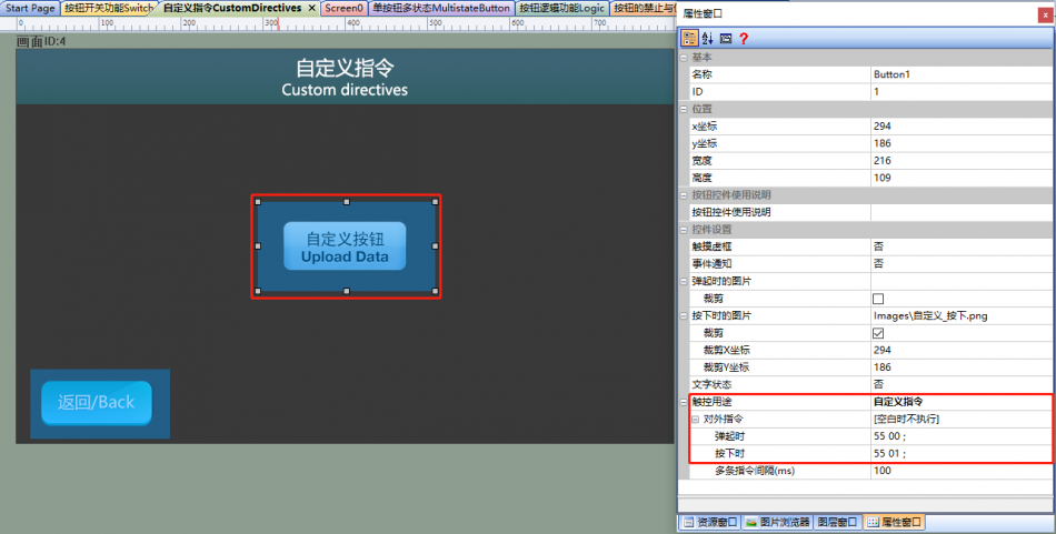
Custom Command
Send custom hexadecimal format data. That is, set up a custom data message for the user to upload after pressing the button. Messages with a frame ending in FF FC FF FF cannot be sent, as it conflicts with the DaCai protocol.
Pop-up Menu
Needs to be used in conjunction with a menu control and a text control to achieve the effect of popping up a menu when the button is clicked. After the user selects the popped-up menu, the selected data is displayed in conjunction with the text control.
1.2 Application of Button Switch Function
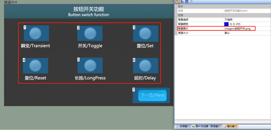
The [Button Switch Function] screen introduces the transient change, switching, setting, resetting, long-pressing, and delay functions of buttons
Screen Configuration
Import the corresponding artwork image for the "Background Image" on the "Button Switch Function" screen. Set up button controls on this screen
Attribute Configuration
- Taking the transient function of the button as an example, set [Touch Dotted Box] to "No", select the processed image for [Image when pressed], check [Crop], set [Touch Purpose] to "Switch Description", and select "Transient" for [Operation Style]
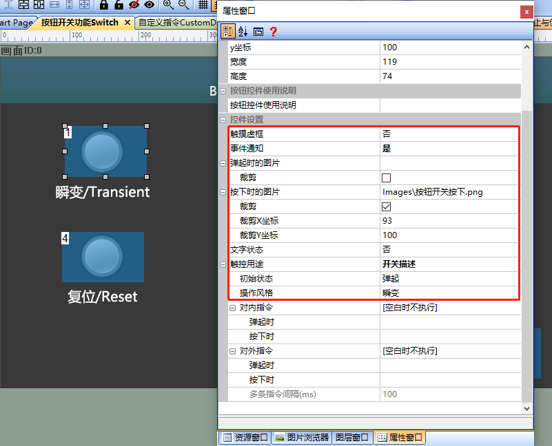 Similarly, the settings for [Touch Dotted Box], [Image When Pressed], [Crop], and [Touch Purpose] for other buttons are the same, but the operation style settings differ. This article will not go into further details
 - The switch setting button has a switch function, with an "Operation Style" of "Switch", as shown below
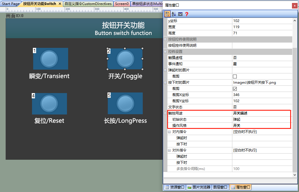
- The set function of the set button, with an "Operation Style" of "Set", is as follows:
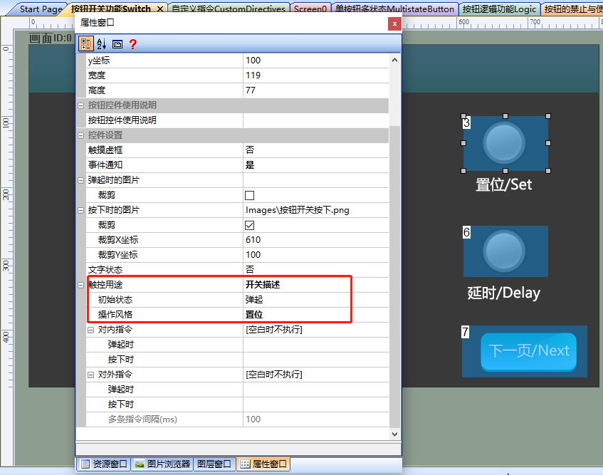
- The reset function of the reset setting button has an [initial state] of "pressed" and an [operation style] of "reset", as shown below
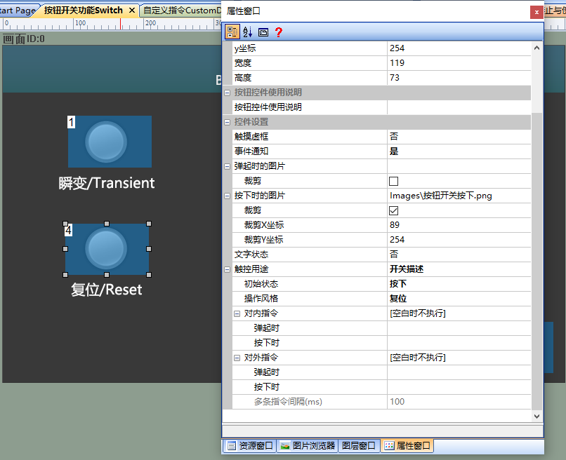
- The long-press function of the "Settings" button, with the "Operation Style" set to "Long Press" and the "Long Press Delay" set to "0.1s", is shown below
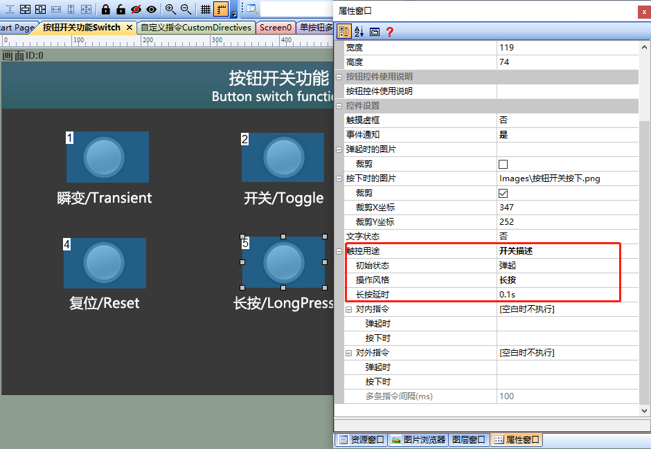
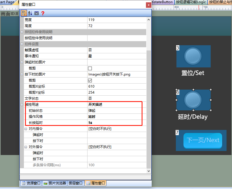
- The delay function of the delay setting button has an "Operation Style" of "Delay" and a "Long Press Delay" of "5s", as shown below
Operation Preview
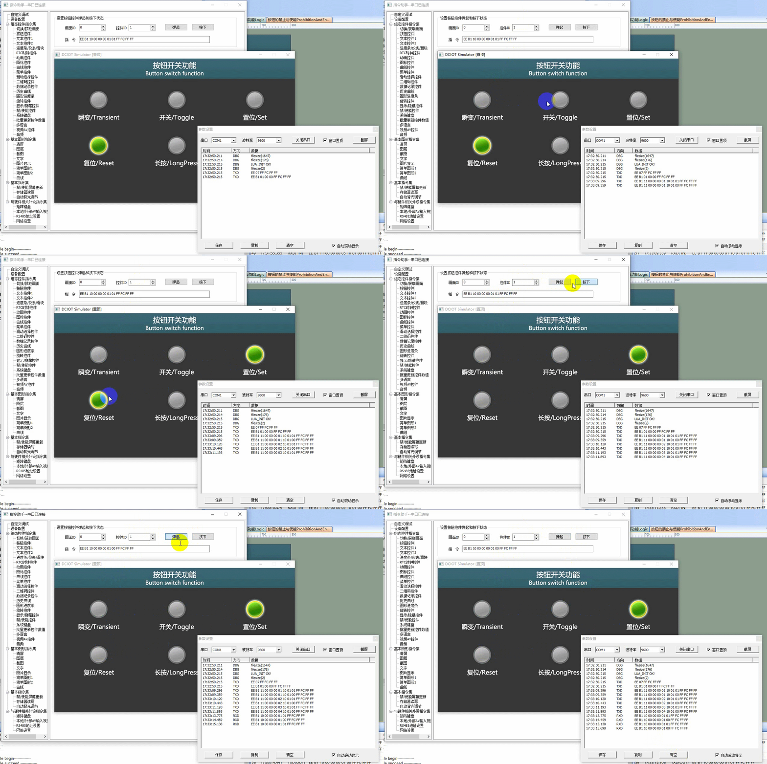
Run the virtual screen, and establish a connection between the VisualTFT software and the virtual screen using "Virtual Serial Port". Open the "Command Assistant", select "Button Control" from the left navigation bar, and set the command parameters for "Setting the Pop-up and Pressed States of Button Controls". When the button control (Control ID: 1) in the setting screen (Screen ID: 0) is pressed, the button control will change from being popped up to being pressed in the virtual screen. The operational effect is as follows:
MCU controls button state
Refer to the function declaration in the him.dever.h file and the definition in the him.dever.c file in the Keil development package. For example, if the user needs to set the button state, they can directly call the set button function SetButtonValue() with the code shown below.
/*******************************************************************
** Function name:     void SetButtonValue(uint16 screen_id,
**                                        uint16 control_id,
**                                        uchar value);
** Descriptions    :  设置按钮状态
** input parameters:
**                   screen_id : 画面ID
**                   control_id: 控件ID
**                   value     : 按钮状态,0为弹起,1为按下
** output parameters : 无
** Returned value    : 无
*******************************************************************/
{
  ……
  SetButtonValue(1, 1, 1); //画面ID1,控件ID1,按钮按下
  ……
}
1.3 Application of Button Logic Function
The screen titled "Button Logic Function Application" introduces the mutually exclusive and master switch control functions of buttons.
Button Mutual Exclusion
Screen Configuration
Import the corresponding artwork image for the "Background Image" in the "Button Switch Function" screen. Set up the button controls in this screen as shown below
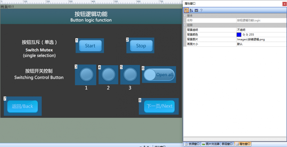
Attribute Configuration
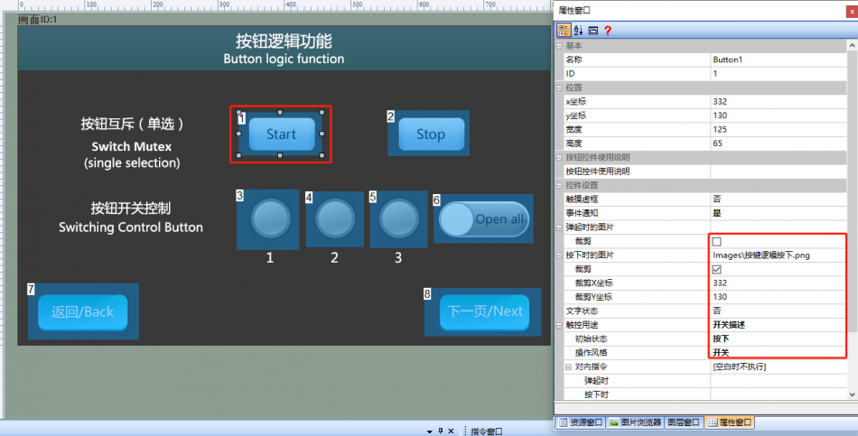
Button "Start": Set [Touch Dotted Box] to "No", select the set image for [Image when pressed], check [Crop], set [Touch Purpose] to "Switch Description", and set [Operation Style] to "Switch". The configuration is shown below
Similarly, the settings for the "Stop" button, including [Touch Hollow Box], [Image When Pressed], [Crop], [Touch Purpose], and [Operation Style], are the same, but the [Initial State] is set to "Pop Up"
Mutually Exclusive Configuration
The setting method for mutually exclusive buttons is as follows: select both buttons "Start" and "Stop" simultaneously, then click [Menu] - [Edit] - [Mutually Exclusive Buttons], enable button mutual exclusion, and the system will automatically add batch processing instructions to the built-in instructions of the buttons. The operation is shown below
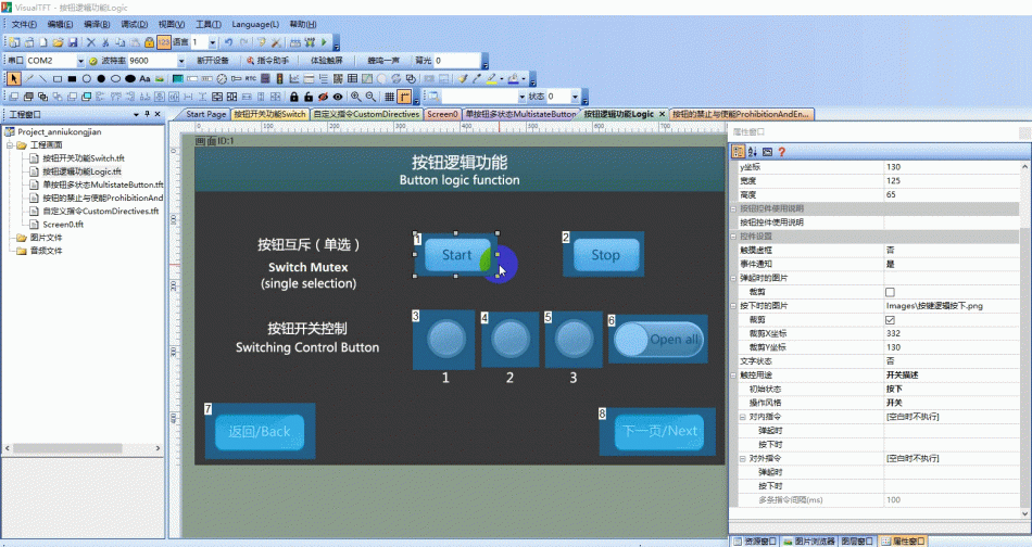
Run Preview
Run the virtual screen, click buttons "Start" and "Stop". Only one button can be pressed at a time. As shown below:
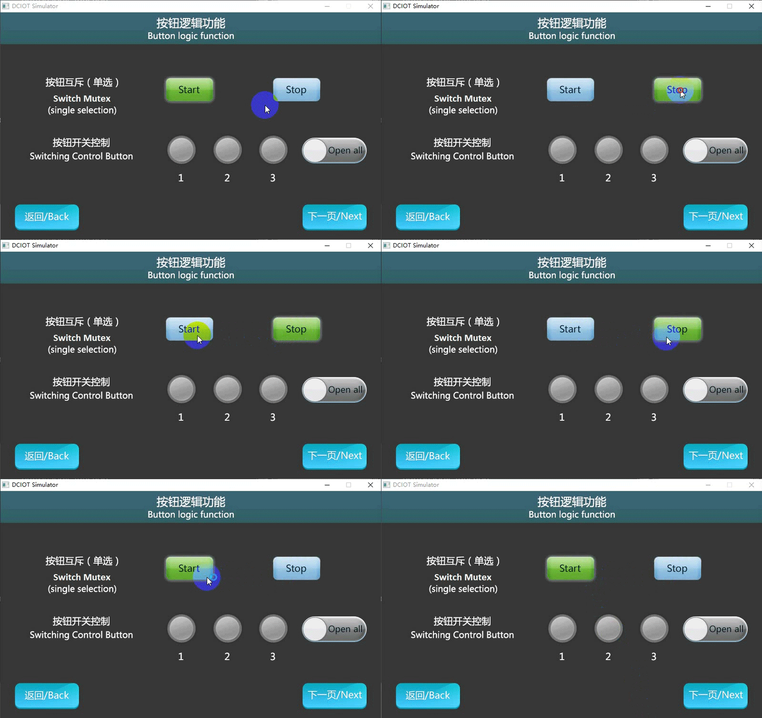
Button Switch Control
Screen Configuration
Import the corresponding artwork image for the "Background Image" on the [Button Switch Function] screen. Set up the button controls on this screen as follows:
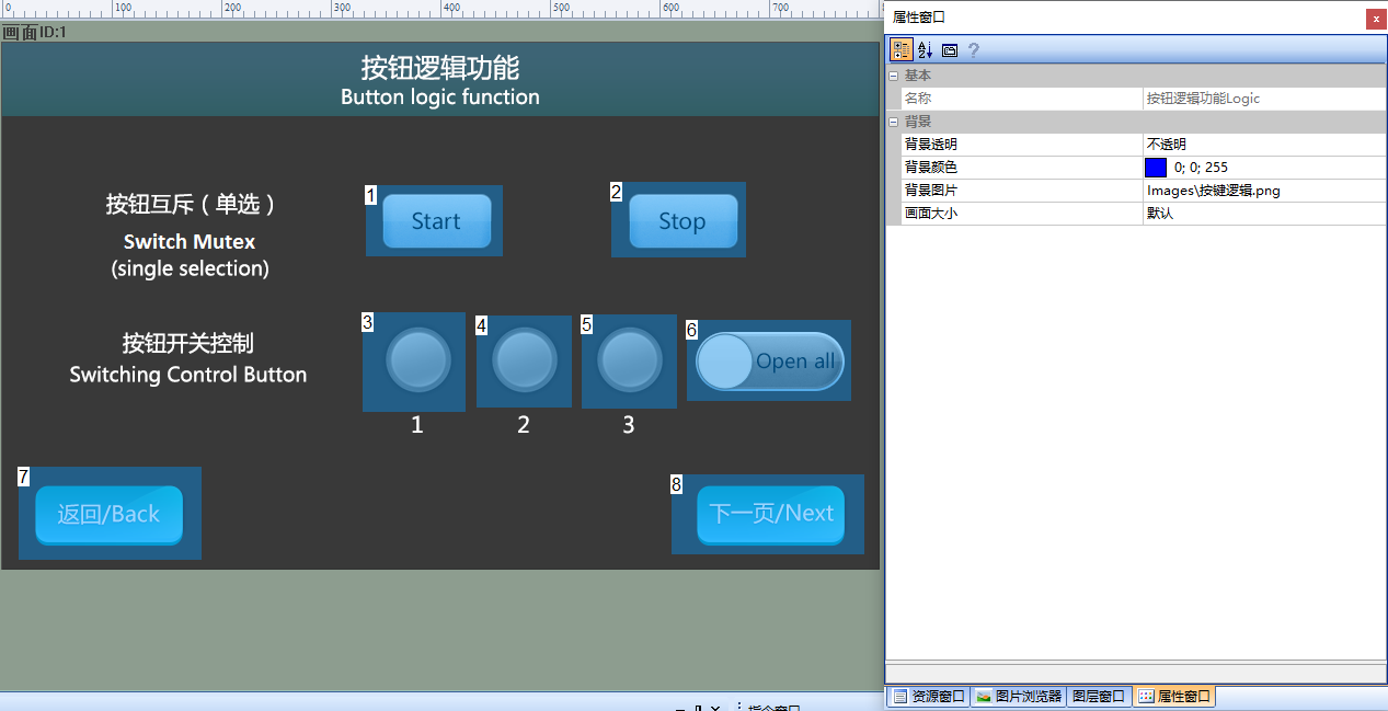
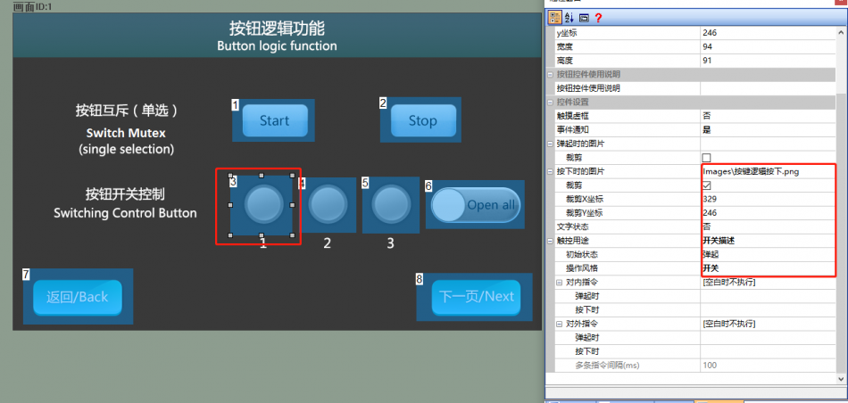
Attribute Configuration
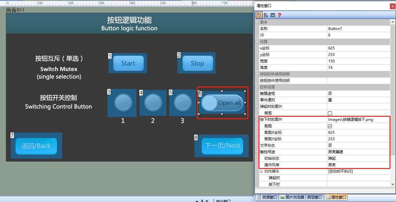
Set buttons 1, 2, and 3. Set [Touch Dotted Box] to "No", select the set image for [Image when pressed], check [Crop], set [Touch Purpose] to "Switch Description", and set [Operation Style] to "Switch", as shown below
Set the button to "Open all", set [Touch Dotted Box] to "No", select the set image for [Image when pressed], check [Crop], set [Touch Purpose] to "Switch Description", and set [Operation Style] to "Switch", as shown below
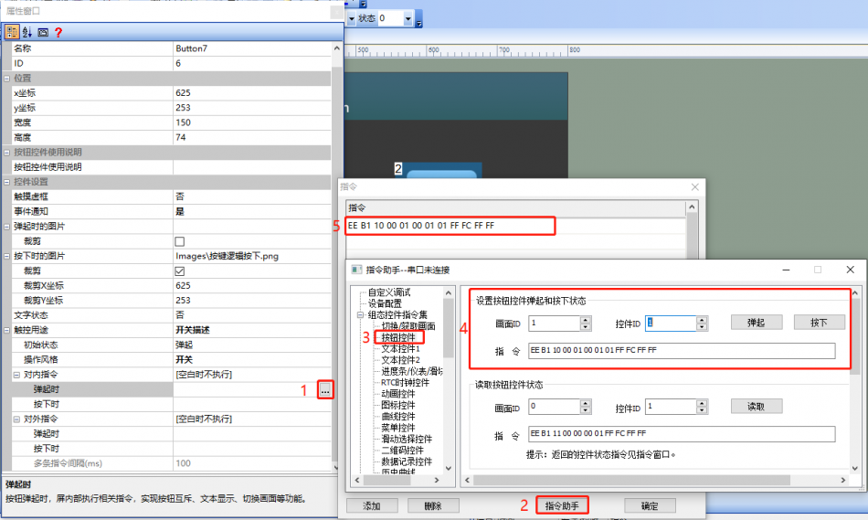
Select button control (control ID: 6)
- In the attribute bar, click on "Internal Command" and then select "When popped up"
- Pop-up command input box, select "Command Assistant"
- In the Command Assistant bar, select button control
- If the status of setting screen ID1 and button control 1 is pressed, click to generate a command
- Copy the command to the Internal Command window
Similarly, for button controls ID2 and ID3, repeat steps 4-5. When button control ID6 pops up, the processing method for the button pop-up state of button controls ID1, 2, and 3 is similar
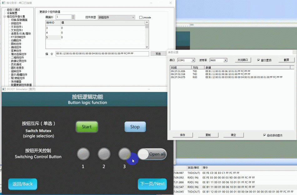
Run Preview
Run the virtual screen, and establish a connection between the VisualTFT software and the virtual screen using "Virtual Serial Port". Open the "Command Assistant", select "Batch Update Control Values" from the left navigation bar, and set the command parameters for "Update Multiple Control Values". Set the "Screen ID" to "1", the "Button Type" to "Button Control", and fill in "3", "4", and "5" for "Button ID", with "1" for "Value" for each. Then, in the virtual screen, the button control will change from popped up to pressed, with the running effect shown below
PS: It also supports sending instructions to control buttons one by one. The operational effect will not be demonstrated here.
MCU batch control button status.
Refer to the function declarations in the him.dever.h file and the definitions in the him.dever.c file in the development package Keil program. For example, if the user needs to batch set the button status of the same page, they can directly call the batch set button function BatchSetButtonValue() as shown below:
/*******************************************************************

** Function name:    void BatchSetButtonValue (uint16 control_id,
**                                             uint8 state);
** Descriptions    : 批量更新当前页面的按钮状态
** input parameters:
**                  control_id: 控件ID
**                  state     : 按钮状态,0为弹起,1为按下
** output parameters: 无
** Returned value   : 无
*******************************************************************/
{
    BEGIN_CMD(); //指令开头
    BatchSetButtonValue(1, 1); //控件ID1,按钮按下
    BatchSetButtonValue(2, 1); //控件ID2,按钮按下
    ……
    END_CMD(); //指令结尾
}
1.4 Single Button Multi-State Application.
The "Single Button Multi-State" screen introduces the functionality of a multi-state button using a single button and an icon.
Screen Configuration.
Import the corresponding artwork image in the "Background Image" of the "Single Button Multi-State" screen. Set the button control in this screen as follows:
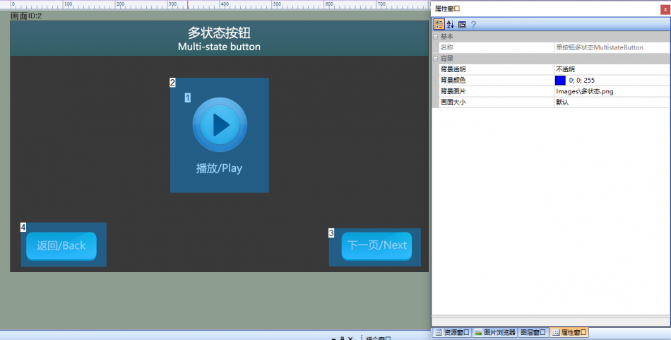
Attribute Configuration.
Set the attributes of the icon control. Select the made ICON file for "Icon File". The configuration is as follows:
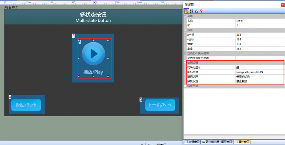
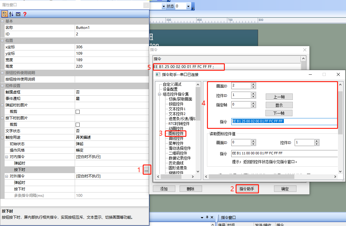
Select the button control (Control ID: 2), set the "Touch Virtual Frame" to "No" in the attribute column, and fill in the corresponding instructions for button press. The steps are as follows:
- [Internal Command] → "When pressed", a command input box pops up
- Select "Instruction Assistant"
- In the Command Assistant interface, select "Icon Control" from the left navigation bar.
- Set the command parameters in the "Icon Control Display" area and fill in the corresponding parameters. For example, for the icon control (Control ID: 1) in the setting screen (Screen ID: 2), click the next frame
- To copy the command to the "Internal Command" → "When pressed" window, follow the steps below:
Run Preview
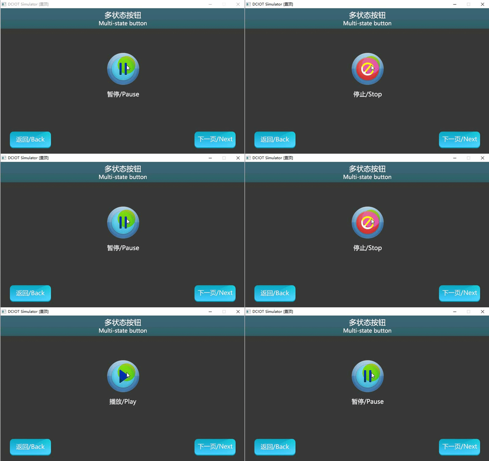
Run the virtual screen, click the button, and the icons will be displayed in a round-robin manner. The VisualTFT software and the virtual screen establish a connection using a "virtual serial port". Open the "Command Assistant", select "Icon Control" from the left navigation bar, and set the command parameters for "Icon Control Display". Set the icon control display of the button control (control ID: 1) in the screen (screen ID: 2) to display the first frame. Then, on the virtual screen, the button displays "Pause". The running effect is shown below
MCU sets the display of icons
Refer to the function declaration in the him.dever.h file and the definition in the him.dever.c file in the development package Keil program. For example, if the user needs to set the display of icons to a specified frame, they can directly call the function AnimationPlayFrame() to set the display frame of the icon, as shown in the code below
/*******************************************************************

** Function name:     void AnimationPlayFrame(uint16 screen_id,
**                                            uint16 control_id,
**                                            uint8 frame_id);
** Descriptions    :  设置图标显示指定的帧
** input parameters:  screen_id:  画面ID
**                    control_id:  控件ID
**                    frame_id:  指定帧
** output parameters: 无
** Returned value   : 无
*******************************************************************/

{
  ……
  AnimationPlayFrame(2, 1, 1); //画面ID2,控件ID1的图标显示第1帧
  ……
}
1.5 Button Disable and Enable Application
The "Button Disable and Enable" screen introduces the use of commands to control the disable and enable of buttons
Screen Configuration
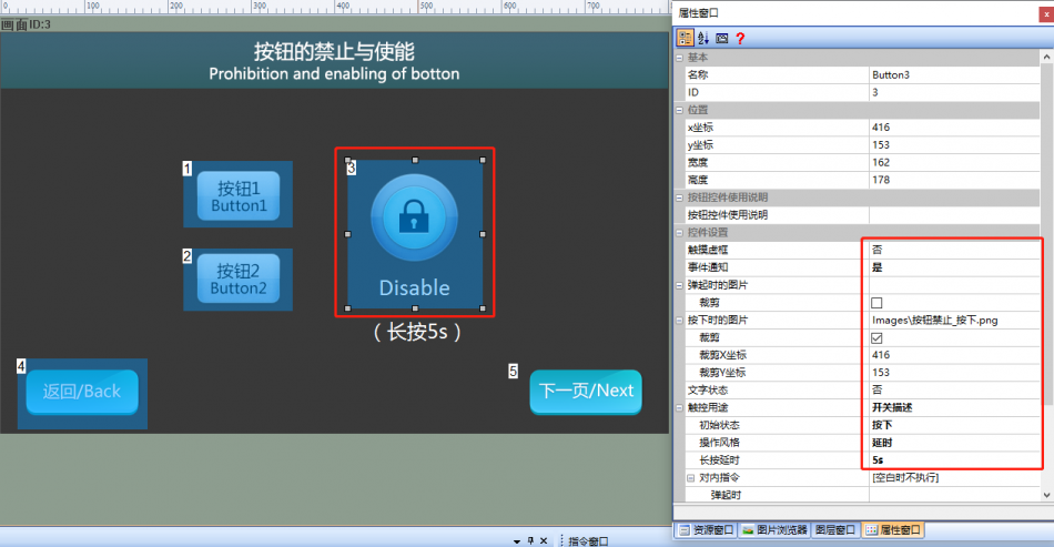
Import the corresponding artwork image for the "Background Image" in the "Button Disable and Enable" screen. Set three button controls (Control IDs: 1, 2, 3) in this screen, as shown below
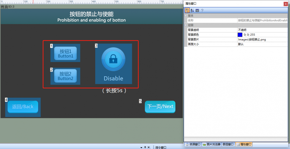
Property Configuration
Set the properties of buttons 1, 2, and 3, and set the "Touch Frame" to "No". Set the properties of button 3, set the "Touch Frame" to "No", select the set image for "Image When Pressed", check "Crop", set "Initial State" to "Pressed", set "Operation Style" to "Delay", and set "Long Press Delay" to "5s". The configuration is shown below.
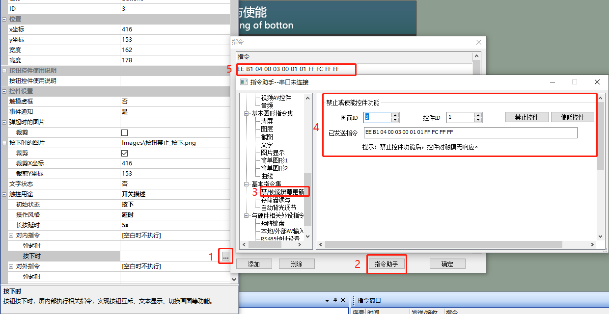
Set the enable/disable state of the button: Select the button control (Control ID: 3)
- "Internal Command" in the property bar → "When Popped Up"
- Pop-up command input box
- Select "Command Assistant", and in the Command Assistant interface
- Select "Disable/Enable Screen Updates" on the left navigation bar, and fill in the corresponding parameters. For example, in the routine, control the icon control (Control ID: 1) in the screen (Screen ID: 3), click "Enable Control"
- Copy the generated command to the command window as shown below. Similarly, refer to the enable/disable operations of other buttons for processing.
Run Preview
Run the virtual screen, and establish a connection between the VisualTFT software and the virtual screen using a "Virtual Serial Port". Open the "Command Assistant", select "Disable/Enable Control" on the left navigation bar, and set the command parameters for "Disable or Enable Control Function". Set the button control (Control ID: 1) in the screen (Screen ID: 3) to disable touch. Then, in the virtual screen, touching button 1 will have no effect.
MCU controls button disable/enable
Refer to the function declaration in the him.dever.h file and the definition in the him.dever.c file in the Keil development package. For example, if the user needs to disable the touch of a button, they can directly call the button disable/enable function SetControlEnable() with the code shown below.
/*******************************************************************

** Function name:     void SetControlEnable (uint16 screen_id,
**                                           uint16 control_id,
**                                           uint8 enable);
** Descriptions    :   设置触摸控件使能
** input parameters:   screen_id :  画面ID
**                     control_id:  控件ID
**                     enable    :  控件是否使能
** output parameters:  无
** Returned value   :  无
*******************************************************************/
{
  ……
  SetControlEnable (2, 1, 1); //画面ID3,控件ID1的按钮禁止触摸
  ……
}
1.6 Custom Command Application
[Custom Command] screen, introducing the function of sending custom commands through buttons
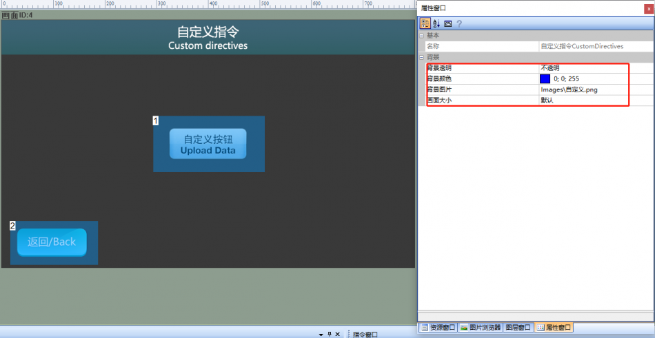
Screen Configuration
Import the corresponding artwork image for the "Background Image" on the "Button Switch Function" screen. Set up a button control (Control ID: 1) on this screen as shown below
Property Configuration
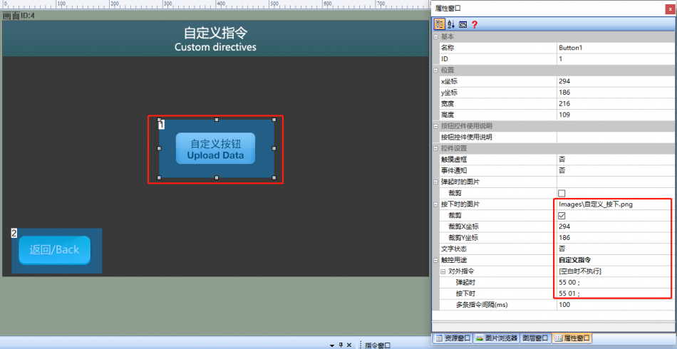
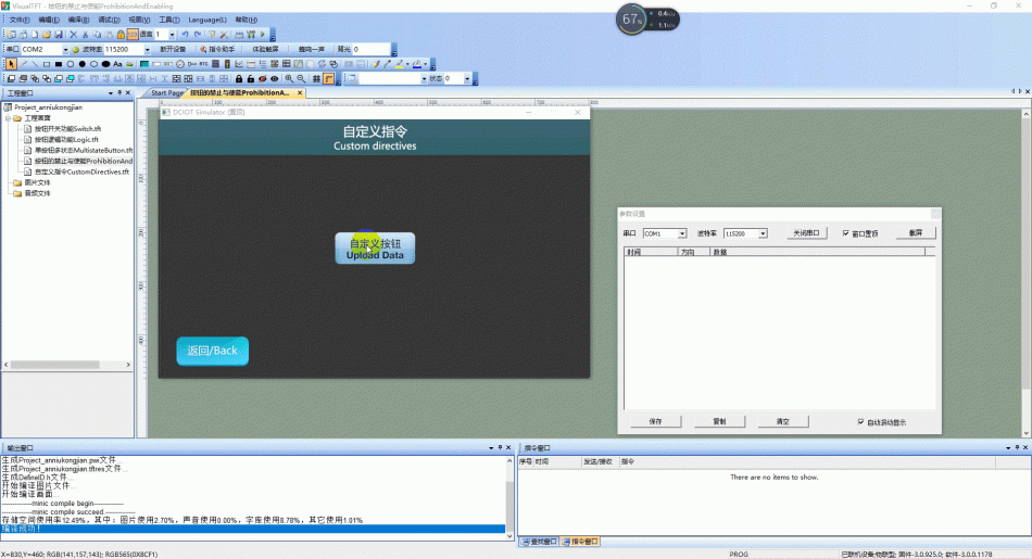
Set the properties of Button 1, set [Touch Dotted Box] to "No", [Event Notification] to "No", select the set image for [Image when pressed], check [Crop], [Touch Purpose] to "Custom Command", [When released] to the custom hexadecimal command "55 00", and [When pressed] to the custom hexadecimal command "55 01". The configuration is shown below
Run Preview
Run the virtual screen, right-click on the screen to pop up the "Parameter Settings" window, click "Customize" and press the send command. The running effect is shown below
Example Document:
[wshop_downloads]


Leave a Reply