
1. Introduction to Input Box
The input box is used in conjunction with a keyboard. Users can enter content into the input box through the keyboard, enabling human-computer interaction and dynamic input. The input box can be applied to scenarios such as password input.
2. How to Add an Input Box
Open or create a project file, click on the input control in the toolbox, and then click on the input box icon to add an input box control, as shown in Figure 2.1.
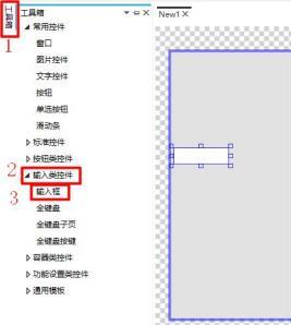 Figure 2.1 Adding an Input Box
3. How to Set the Appearance of the Input Box
3.1 How to Set the Image in the Input Box
Select the input box and click on the image in the property window on the right to set the background of the input box. Click the add button to add the selected input display of the input box. The background is the image displayed when the input box is not in operation. The selected input display is the content displayed when the input box is clicked for input, as shown in Figure 3.1.
Figure 2.1 Adding an Input Box
3. How to Set the Appearance of the Input Box
3.1 How to Set the Image in the Input Box
Select the input box and click on the image in the property window on the right to set the background of the input box. Click the add button to add the selected input display of the input box. The background is the image displayed when the input box is not in operation. The selected input display is the content displayed when the input box is clicked for input, as shown in Figure 3.1.

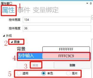 Figure 3.1 Image Settings
3.2 How to Set the Text in a Text Input Box
The text settings of the input box are the same as those of the text control. The specific operations are not repeated here. For details, please refer to the "Text Control User Manual", as shown in Figure 3.2.
Figure 3.1 Image Settings
3.2 How to Set the Text in a Text Input Box
The text settings of the input box are the same as those of the text control. The specific operations are not repeated here. For details, please refer to the "Text Control User Manual", as shown in Figure 3.2.
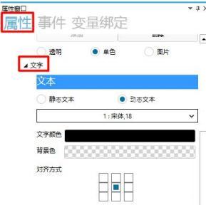 Figure 3.2 Text Settings
4. How to set miscellaneous options for input boxes
Click in the property window on the right to set the input text length limit, input mode, and whether to obtain input focus upon initialization for the input box, as shown in
Figure 4.1.
Figure 3.2 Text Settings
4. How to set miscellaneous options for input boxes
Click in the property window on the right to set the input text length limit, input mode, and whether to obtain input focus upon initialization for the input box, as shown in
Figure 4.1.
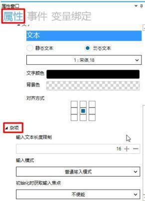 Figure 4.1: Setting Miscellaneous Options
4.1 How to set the input text length limit
Click the input box under "Input Text Length Limit" and set the input text length limit using the keyboard or the "+" and "-" buttons. Setting the input text length limit restricts the length of text that can be entered into the input box, as shown in Figure 4.2.
Figure 4.1: Setting Miscellaneous Options
4.1 How to set the input text length limit
Click the input box under "Input Text Length Limit" and set the input text length limit using the keyboard or the "+" and "-" buttons. Setting the input text length limit restricts the length of text that can be entered into the input box, as shown in Figure 4.2.
 Figure 4.2: Setting Input Text Length Limit
4.2 How to set the input mode
Click the dropdown box under "Input Mode", which includes Normal Input Mode, Password Input Mode, and Network IP Input Mode. Normal Input Mode is the display mode for input, Password Input Mode displays "*" for input, and Network IP Input Mode displays "192.xxx.xxx" in the form of a network segment for input, as shown in Figure 4.3.
Figure 4.2: Setting Input Text Length Limit
4.2 How to set the input mode
Click the dropdown box under "Input Mode", which includes Normal Input Mode, Password Input Mode, and Network IP Input Mode. Normal Input Mode is the display mode for input, Password Input Mode displays "*" for input, and Network IP Input Mode displays "192.xxx.xxx" in the form of a network segment for input, as shown in Figure 4.3.
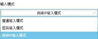 Figure 4.3: Setting Input Mode
4.3 How to set the input focus upon initialization
Click "Obtain Input Focus Upon Initialization", which includes Disabled and Enabled options. Disabled means that during simulation, keyboard input requires clicking the input box to obtain focus before entering text. Enabled means that during simulation, keyboard input can be directly entered into the input box, as shown in Figure 4.4.
Figure 4.3: Setting Input Mode
4.3 How to set the input focus upon initialization
Click "Obtain Input Focus Upon Initialization", which includes Disabled and Enabled options. Disabled means that during simulation, keyboard input requires clicking the input box to obtain focus before entering text. Enabled means that during simulation, keyboard input can be directly entered into the input box, as shown in Figure 4.4.
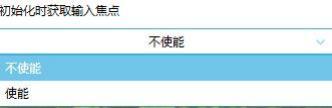 Figure 4.4 Set input focus when initializing
5. How to set the password interface through the input box
The password window is used for verifying the entered password. If the correct password is entered, the window will switch to window NEW2. The specific settings are as follows.
1. How to add controls
Click the input control in the toolbox, select the input box and keyboard icon to add an input box and keyboard. Click the function setting control in the toolbox, select the password verification button icon to add a password verification button. Click the window icon in the common control module to add window NEW2, as shown in Figure 5.1.
Figure 4.4 Set input focus when initializing
5. How to set the password interface through the input box
The password window is used for verifying the entered password. If the correct password is entered, the window will switch to window NEW2. The specific settings are as follows.
1. How to add controls
Click the input control in the toolbox, select the input box and keyboard icon to add an input box and keyboard. Click the function setting control in the toolbox, select the password verification button icon to add a password verification button. Click the window icon in the common control module to add window NEW2, as shown in Figure 5.1.
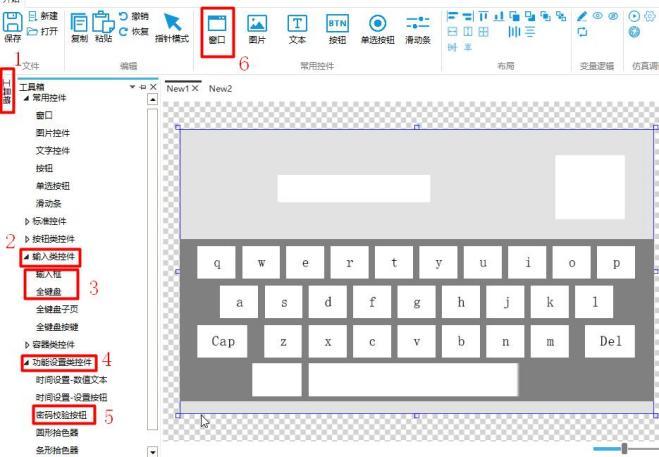 Figure 5.1 Adding Controls
2. How to set the position and size of controls
Select the input box, and use the mouse or the public properties in the right property window to set the position and size of the input box (the operation for the password verification button is the same), as shown in Figure 5.2.
Figure 5.1 Adding Controls
2. How to set the position and size of controls
Select the input box, and use the mouse or the public properties in the right property window to set the position and size of the input box (the operation for the password verification button is the same), as shown in Figure 5.2.
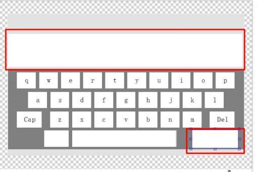 Figure 5.2 Setting the Position and Size of Controls
3. How to set the input box
Select the input box → modify the control name of the input box to "1" → set the input mode to "Password Input Mode" → enable the setting of obtaining input focus when initializing, as shown in Figure 5.3.
Figure 5.2 Setting the Position and Size of Controls
3. How to set the input box
Select the input box → modify the control name of the input box to "1" → set the input mode to "Password Input Mode" → enable the setting of obtaining input focus when initializing, as shown in Figure 5.3.
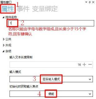 Figure 5.3 Setting the Input Box
4. How to set the password verification button
Select the password verification button → enter "Confirm" for text setting → set miscellaneous items → enter "1" for the password input box control name (consistent with the control name set in the previous input box) → enter the password to be verified, such as "123456", as shown in Figure 5.4.
Figure 5.3 Setting the Input Box
4. How to set the password verification button
Select the password verification button → enter "Confirm" for text setting → set miscellaneous items → enter "1" for the password input box control name (consistent with the control name set in the previous input box) → enter the password to be verified, such as "123456", as shown in Figure 5.4.
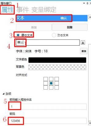 Figure 5.4: Setting the password verification button
5. How to set the password verification button event
Select the password verification button, click "Events" in the property window on the right → click "Add" → set the event to "Password verification correct" → click "..." under "Processing method" to pop up the processing method window → select "Switch window" in the window switcher → select NEW2 as the target window, as shown in Figure 5.5.
Figure 5.4: Setting the password verification button
5. How to set the password verification button event
Select the password verification button, click "Events" in the property window on the right → click "Add" → set the event to "Password verification correct" → click "..." under "Processing method" to pop up the processing method window → select "Switch window" in the window switcher → select NEW2 as the target window, as shown in Figure 5.5.
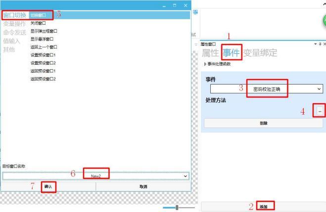 Figure 5.5: Event setting
6. Simulation demonstration
Click the simulation run button
Figure 5.5: Event setting
6. Simulation demonstration
Click the simulation run button
 , and the simulation run window will pop up
. Enter the password "123456", click the confirm button, and the window will switch to NEW2, as shown in Figure 5.6.
, and the simulation run window will pop up
. Enter the password "123456", click the confirm button, and the window will switch to NEW2, as shown in Figure 5.6.
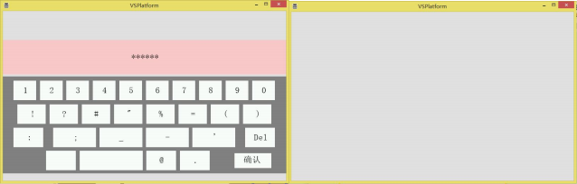 Figure 5.6: Enter password confirmation
Enter an incorrect password, click the confirm button, and there will be no action response, as shown in Figure 5.7.
Figure 5.6: Enter password confirmation
Enter an incorrect password, click the confirm button, and there will be no action response, as shown in Figure 5.7.
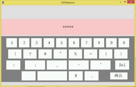 Figure 5.7 Entering an incorrect password
If you have gained something, please give a like


Leave a Reply