
1. How to add button-type controls
Click the corresponding icon in the shortcut bar or toolbox to add controls, as shown in Figure 1.1.
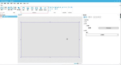
Figure1.1 Add controls
Note: The controls listed in the shortcut bar are commonly used, and the button-type controls in the toolbox include all button controls.
The user clicks the window where the control needs to be added, selects the control, and the mouse changes to an icon, indicating that it can be added;
Click the left mouse button to continue adding, and click the right mouse button or click in the editing module to stop adding.
2. How to modify the position, size, and appearance of controls
2.1 How to modify the position and size of controls
Select the control, click the left mouse button to drag and resize the control, or click the property window on the right to make precise adjustments to the position and size, as shown in Figure 2.1.
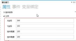
Figure2.1 Modifying Public Attributes
2.2 How to Modify Appearance Attributes
Select the control and click →
→ in the property window on the right, as shown in Figure 2.2.
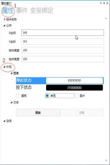
Figure2.2 Modifying Appearance Attributes
Click "Pop-up State", and there are three options: Transparent, Single Color, and Image, as shown in the table below. You can click to switch between them.
|
Transparent |
The control is displayed in a transparent state |
|
Single Color |
The control is displayed in a single color. Click |
|
Image |
The control is displayed in the form of an image. Click |


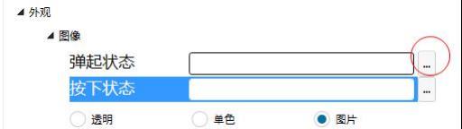
Figure2.3 Image Replacement
Note: If a large number of images are used, the image management function can be used for batch image addition, replacement, classification, and management. For specific operations, see the image management instructions.
2.3 How to Add Text to a Button Control
Select the button control and click →
→ in the property window on the right, as shown in Figure 2.4.
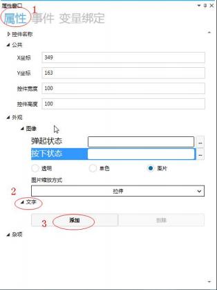
Figure2.4 Text Addition
Click on the text to add and set the text content. Static text is optional, as shown in Figure 2.5.
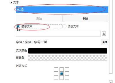
Figure2.5 Static Text
Enter content in the static text input box, which can be directly displayed in the window.
2.3.1 How to Modify Font
Click the button on the right side of the font to pop up the font modification window, where you can modify the font size and other settings according to your needs, as shown in Figure 2.6.
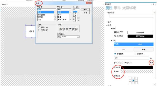
Figure2.6 Modify Font
2.3.2 How to Modify Text Color
Click the box on the right side of the text color to pop up the color palette, where you can modify the text color according to your needs. The default text color is black, as shown in Figure 2.7.
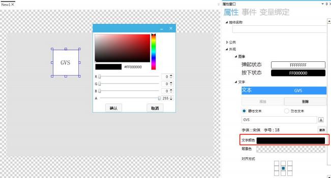
Figure2.7 Modify Text Color
2.3.3 How to Modify Background Color
Click the box on the right side of the background color to pop up the color palette, where you can modify the background color according to your needs. The default background color is transparent, as shown in Figure 2.8.
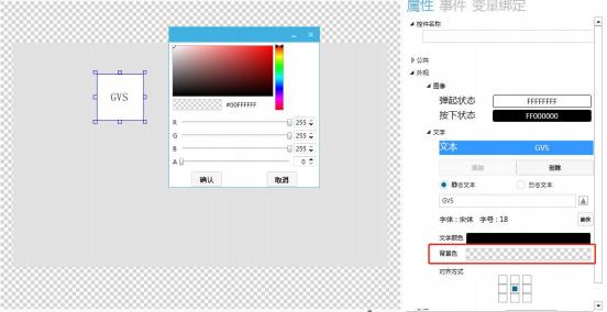
Figure2.8 Modify Background Color
2.3.4 How to Modify Alignment
Click the button under Alignment, where you can modify the alignment of the text according to your needs. The default alignment is centered, as shown in Figure 2.9
.
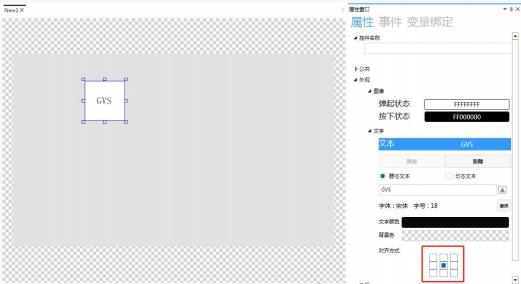
Figure2.9 Modify Text Alignment
3. Button Control Application
3.1 Control Introduction
The button control is similar to a switch in daily life, where users can perform operations by clicking. The button control can display text and images. When clicked, the control can trigger functions such as page navigation, increasing or decreasing numerical values.
3.2 How to Replace Images
Select the button control and click the property window on the right to modify the image. The up state is the state displayed when the button is not operated; the down state is the state displayed when the button is pressed. The steps for image replacement are shown in Figure 3.1.
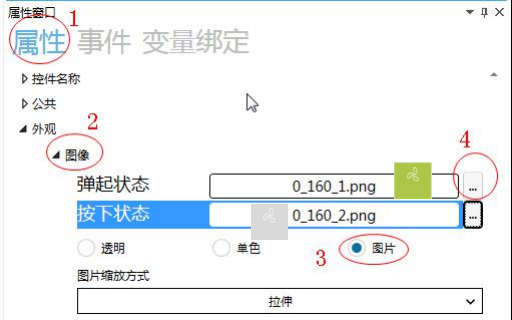
Figure3.1 Image Replacement
During simulation, when the button is not operated, the up state image is displayed, as shown in Figure 3.2.
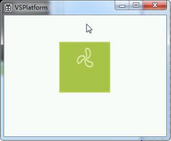
Figure3.2 Up State
Click the button, and the down state image is displayed, as shown in Figure 3.3.
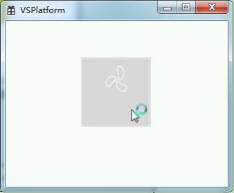
Figure3.3 Down State
3.3 Application Cases
3.3.1Event List
Event List, as illustrated in the table below:
|
Control Initialization |
Event triggered when the "Button" control is initialized |
|
Control Destruction |
Event triggered when the "Button" control is destroyed |
|
Click |
Event triggered when the "Button" control is clicked (non-sliding) |
|
Long Press |
Event triggered when the "Button" control is long pressed (for 500ms) |
|
Touch Press |
Event triggered when the "Button" control is pressed (not yet fully clicked, just pressed) |
|
Gaining Focus |
An event is triggered when the "Button" control is pressed (the image has been switched to the pressed state). |
|
Losing Focus |
An event is triggered when the "Button" control recovers from being pressed to its normal state. |
3.3.2Window Switching
Window switching involves clicking the button to switch from the current window to the target window. The specific setting method is as follows.
1How to Add an Event
Select the button control and click "Events" in the property window on the right to add an event, as shown in Figure 3.4.
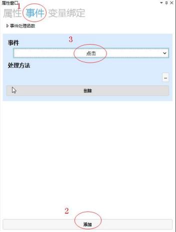
Figure3.4 Add Event
2How to Set the Handling Method
Click the lower right corner of the handling method to pop up the handling method window, select "Window Switching" and set the target window, as shown in Figure 3.5.
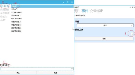
Figure3.5 Window Switching
3.3.3How to Send Using Button ControlsTDFHStandard Protocol
1and How to Add Events
The operation method for adding events is the same as that for window switching, and will not be repeated.
2and How to Set the Processing Method
The standard protocol is a private protocol of the TDFHUI editing tool, allowing operations such as modifying variables and sending events.
Click on the lower right corner of the processing method , and a processing method window will pop up. Select the command "Send" → select the "Standard Protocol" to send an event command
→ set the event number, as shown in Figure 3.6.
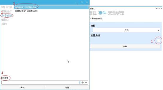
Figure3.6 "Standard Protocol" Send Event Command
3and How to View Standard Protocol Instructions Sent by Button Controls
When the event number is set to 1, click the simulation run button . Click the button in the simulation interface to view the sent commands, as shown in Figure 3.7.
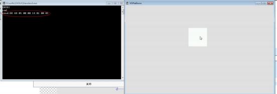
Figure3.7 Send the [Standard Protocol] command
3.3.4. How to use the button control to send custom protocols
1, how to add events
, and how to switch between adding events in the same window are consistent with the operation method and will not be repeated.
2, how to set the processing method
. Custom protocols allow users to use other protocols in the project, such as the Modbus protocol.
Click the lower right corner of the processing method , and a processing method window will pop up. Select "Command Send" → select "Custom Protocol" to send serial port commands → set the command
, as shown in Figure 3.8.
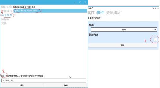
Figure3.8 [Custom Protocol] Send Serial Command
Note: When clicking the input box for sending serial port commands in [Custom Protocol], a window for describing custom command functions will pop up, as shown in Figure 3.9.
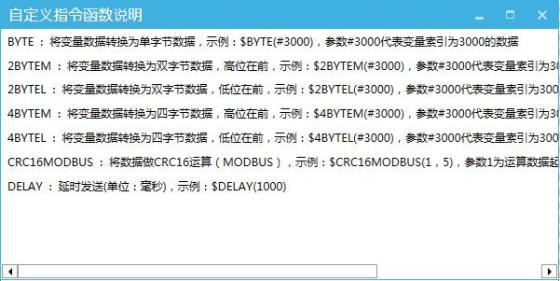
Figure3.9 Custom Command Function Description Window
3How to view the standard protocol commands sent by the button control
When sending a custom protocol command "AB CD EF 01 $BYTE(#3000) $CRC16MODBUS(1,5) $DELAY(1000)", click the Simulate Run
button , and then click the button in the simulation interface to view the sent command, as shown in Figure 3.10.
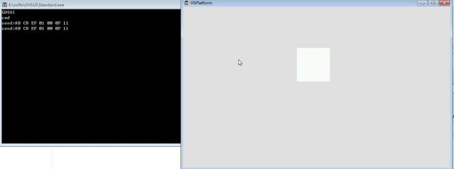
Figure3.10 Send the [Custom Protocol] command
3.4 How to use the button control for text input
For the application of text input through the button control, see the "Input Box Usage" manual for details.
3.5 How to use the button control to set parameters
Click to change the valve opening time through the button control. The specific setting operation is as follows.
1Add a custom variable
Add a custom variable to store the value of the valve start time, as shown in Figure 3.11. For specific steps on how to add, refer to the "Application of Variables" manual.

Figure3.11 Valve start time setting variable
2, How to add button controls and text controls
Create a new text control to display the valve start time. Click on the button controls and text controls in the common modules to add, as shown in Figure 3.12.
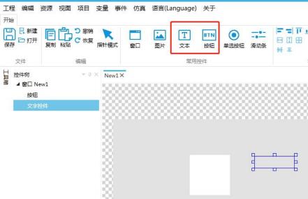
Figure3.12 Add button controls and text controls
3, How to add variable binding
Select the text control, click on "Variable Binding" in the property window on the right, click "Add", and set the bound control properties, data source binding, conversion mode, and conversion method, as shown in Figure 3.9.
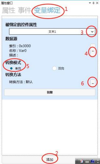
Figure3.9 Add variable binding
4, How to add events
Add the event as "Click", with the same operation method as above. For specific details, refer to the3.3.2window switching case.
5, How to set the processing method
Click on the lower right corner of the processing method , and a processing method window will pop up. Select Variable Operation → Select Variable Settings → Set Target Variable → Use Constant. Enter 1 in the
input box, which means that after clicking the button, the value of the Var0 variable will change from the initial value of 0 to 1. The variable operations in other processing methods are the same as above. As shown in Figure 3.11.
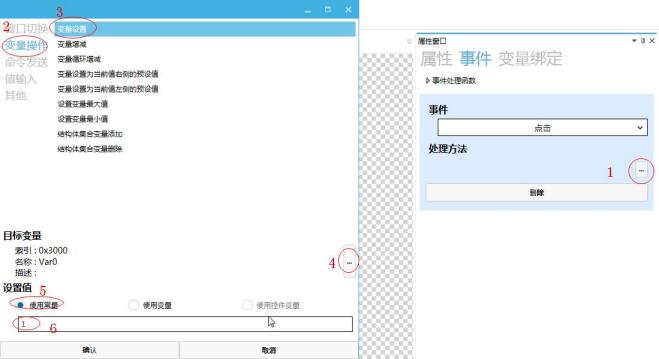
Figure3.11 Set parameter processing method
6, how to obtain the valve start time
Users can obtain the valve opening time through protocol instructions. For specific operational steps, please refer to the protocol for sending instructions.
3.6 How to quickly change the value by long pressing
How to add button controls and text controls
The specific operational steps are the same as in the previous case.
How to add variable binding
The specific operational steps are the same as in the previous case.
How to add long press events
Select the button control, click the property window on the right, and add a long-press event, as shown in Figure 3.10.
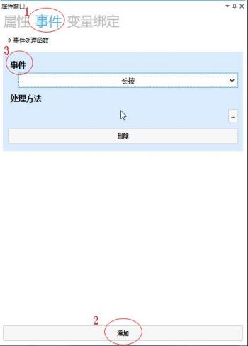
Figure3.10 How to set the handling method for the long-press event
How to set the processing method
Click the lower right corner of the handling method , a window for handling methods will pop up. Select Variable Operation → Select Variable Loop Increment/Decrement → Set Target Variable → Set Step
Value, as shown in Figure 3.11.
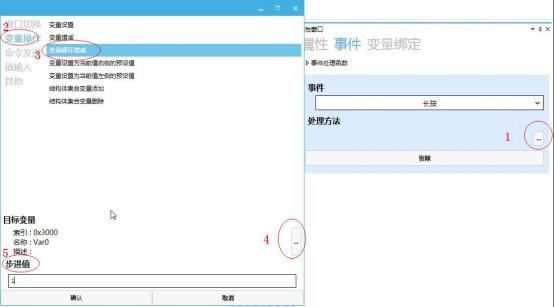
Figure3.11 Handling Method
Simulation Demonstration
During simulation, long-pressing the button control can quickly increase the value displayed on the text control, as shown in Figure 3.12.
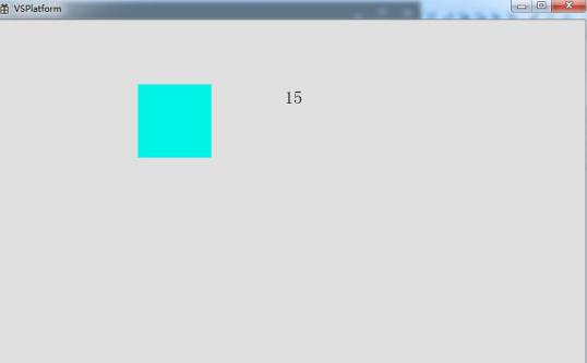
Figure3.12 Simulation Demonstration Effect
4. Single-Selection Button (Self-Locking Button) Application
4.1 Control Introduction
The radio button control can be understood as a switch button, with unselected and selected states. Switch operations can be achieved through this control.
4.2 How to replace an image
Select the radio button control and click the property window on the right to modify the image.
When the radio button is clicked and pressed, it is in the selected state; when the radio button is not operated or clicked again from the selected state, it pops up and is in the unselected state. The operation steps are shown in Figure 4.1.
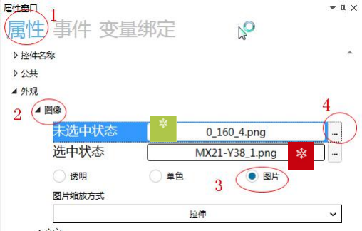
Figure4.1 Image replacement
During simulation, when the radio button is not operated orclicked again from the selected state,it displays the unselected state, as shown in Figure 4.2.
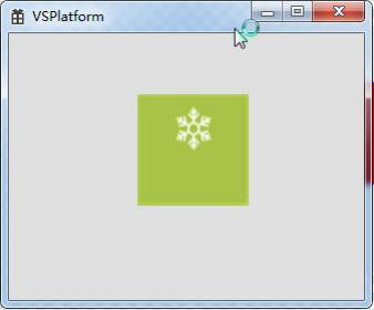
Figure4.2 Unselected state
When the radio button is clicked and pressed, the selected state is displayed, as shown in Figure 4.3.
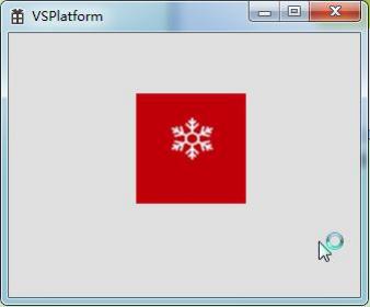
Figure4.3 Selected state
4.3 Application case
4.3.1Event List
Event List, as described in the table below:
|
Control Initialization |
Event triggered when the "Radio Button" is initialized |
|
Control Destruction |
Event triggered when the "Radio Button" is destroyed |
|
Touch Press |
Event triggered when the "Radio Button" is pressed (not yet completed, only pressed) |
|
Selected |
Event triggered when the "Radio Control" is in the selected state |
|
Not Selected |
Event triggered when the "Radio Control" is in the unselected state |
4.4.1How to send using a radio buttonTDFHstandard protocol
1and how to add an event
Select the radio button control, click on the property window on the right to add an event. The operation method is shown in Figure 4.4.
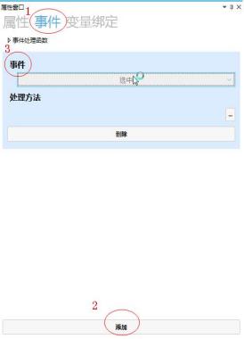
Figure4.4 Add event
2and how to set the processing method
Click on the lower right side of the processing method , and a processing method window will pop up. Select the command "Send" → select the "Standard Protocol" to send the event command → set the event
number, as shown in Figure 4.5.
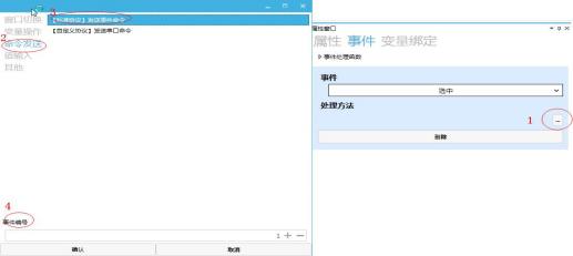
Figure4.5 "Standard Protocol" send event command
4.4.2How to send using a radio button
1custom protocol and how to add an event
Select "Command Send" → Select "Custom Protocol" to send serial port commands → Set the command, as shown in Figure 4.6.
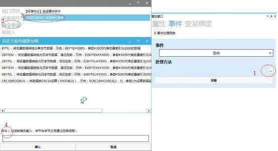
Figure4.6 "Custom Protocol" to send serial port commands
4.4.3How to configure the interlock button
The interlock is a feature where multiple radio buttons are in the same window. When one radio button is selected, the other radio buttons automatically revert to an unselected state. The setting method for interlock
is that the combined names of the radio buttons in the same window must be consistent, as shown in Figure 4.7.
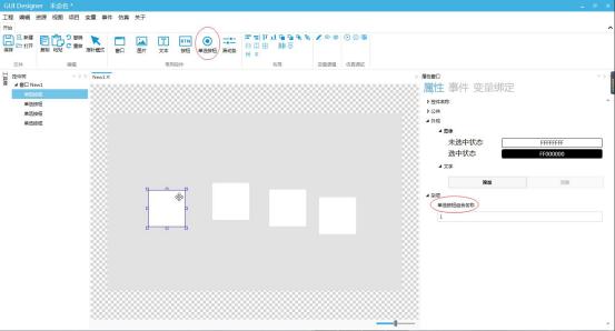
Figure4.7 Interlock
5. Multiple Group Button Application
5.1 Control Introduction
The multiple group button control is suitable for situations where both the functionality of a button control and the display of different states on the button with images are required.
When the data attribute bound to the variable is an image index, the corresponding set of state images will be called based on the bound value, achieving the function of autonomous switching between different states.
5.2 How to Replace Images
Select the multiple group button control, click the property window on the right to modify the image. Click "Add" to add multiple sets of different state images. The state displayed when the button is not operated is the up state, and the state displayed when the button is pressed is the pressed state. The specific steps are shown in Figure 5.1.
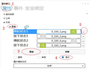
Figure5.1 Image replacement
During simulation, the button does not operate and displays a popped-up state 1 image, as shown in Figure 5.2.
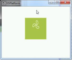
Figure5.2 Popped-up state
When the button is clicked and pressed, it displays a pressed state 1 image, as shown in Figure 5.3.
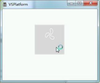
Figure5.3 Pressed state
5.3 Application case
5.3.1Event list
Event list, as explained in the following table:
|
Control initialization |
The "Button" control triggers an event when it is initialized |
|
Control destruction |
The "Button" control triggers an event when it is destroyed |
|
When the |
"Button" control is clicked (non-sliding), the event |
|
is triggered. When the |
"Button" control is long pressed (for 500ms), the event |
|
is triggered. When the |
"Button" control is pressed (not yet fully clicked but only pressed) through touchscreen interaction, the event |
|
is triggered. When the "Button" control gains focus (has switched to the pressed image), the event |
is triggered. When the "Button" control loses focus (returns from being pressed to being popped up), the event |
|
is triggered. The protocol-related operations are similar to those of button controls and will not be repeated. |
The "Button" control triggers an event when it returns to its up state after being pressed |
The operation related to the protocol is similar to that of button controls, and will not be repeated here.
5.3.2How to dynamically switch between different images using multiple sets of buttons
Click the multi-group button in the main interface (window NEW1) to switch to the mode selection interface (window NEW2). In the mode selection interface, click to select the desired mode, and then return to the main interface. The multi-group button images in the main interface will display the corresponding mode pictures and activate the mode.
Operation steps
1. Open or create a new project, click on the window in the common control module, and add two windows as shown in Figure 5.4.
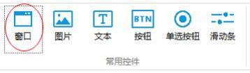
Figure5.4 Add window
2. Add a multi-group button control in window NEW1, select the multi-group button to add and set events, as shown in Figure 5.5.
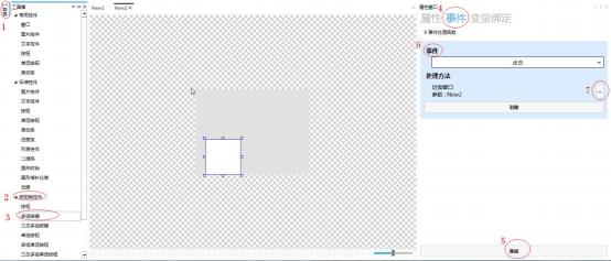
Figure5.5 Add multi-group button and add events
3. Select the multi-group button control in window NEW1, click on the variable binding in the property window to bind variables, as shown in Figure 5.6.
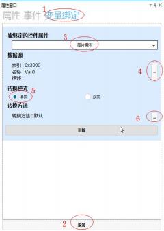
Figure5.6 Multi-group button variable binding
4. Click on window NEW2, add two button controls, and add two events to both button controls, both triggered by clicking. One event is to switch the window to NEW1, and the other is "Variable operation" - "Variable setting", with the target variable bound to "Var0" and the setting value set to a constant. Enter "0" in the input box for the first button, and enter "1" in the input box for the second button, as shown in Figure 5.7.
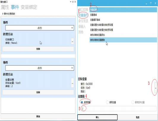
Figure5.7 Event settings for button controls
5. Set the button control images, as shown in Figure 5.8 (Note: The image settings for the multi-group button are the same as those in "MBI_239" Image replacement and simulation demonstration)Image replacement and simulation demonstration(No repetition)
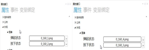
Figure5.8 Set image
6. During the simulation demonstration, clicking multiple sets of buttons can switch to the NEW2 window, and clicking button 2 can switch to the NEW1 window. The image of the multiple sets of buttons displays the second set of images for switching, as shown in Figures 5.9 and 5.10.
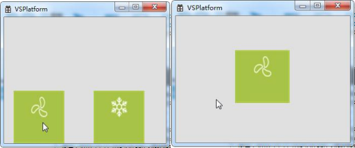
Figure5.10 Click button1
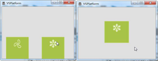
Figure5.9 Click button2
6. Application of three-state multiple sets of buttons
6.1 Introduction to controls
The three-state multiple sets of buttons have the same function as multiple sets of buttons, and additionally have an invalid state display function for setting buttons in an invalid state (non-usable state).
6.2 How to replace images
Select the three-state multiple sets of buttons control,click the property window on the right, and modify the image of the three-state multiple sets of buttons. The operation steps are shown in Figure 6.1.
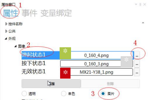
Figure6.1 Image replacement
Pop-up State 1 is the state displayed when multiple sets of three-state buttons are not operated;
Pressed State 1 is the state displayed when multiple sets of three-state buttons are pressed;
Invalid State 1 is the state displayed when multiple sets of three-state buttons are not enabled.
During simulation, when multiple sets of three-state buttons are not operated, Pop-up State 1 is displayed, as shown in Figure 6.2.
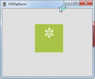
Figure6.2 Pop-up State1
When multiple sets of three-state buttons are clicked and pressed, Pressed State 1 is displayed, as shown in Figure 6.3.
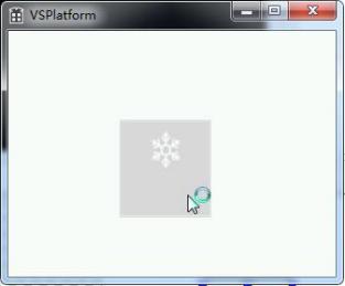
Figure6.3 Pressed State1
When multiple sets of three-state buttons are in an unenabled state, Invalid State 1 is displayed, as shown in Figure 6.4.
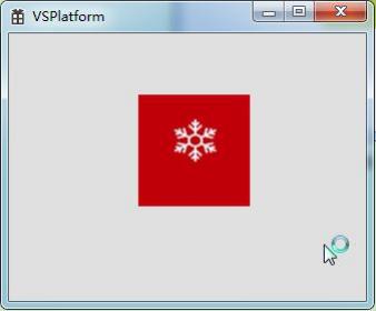
Figure6.4 Invalid State
6.3 Application Cases
6.3.1Event List
The event list is described in the table below:
|
Control initialization |
Event triggered when the "Button" control is initialized |
|
Control destruction |
Event triggered when the "Button" control is destroyed |
|
Click |
Event triggered when the "Button" control is clicked (non-sliding) and takes effect |
|
Long press |
Event triggered when the "Button" control is long pressed (for 500ms) |
|
Touch press |
Event triggered when the "Button" control is pressed (not yet completed clicking, only pressed) |
|
Gaining focus |
Event triggered when the "Button" control is pressed (has switched to the pressed image) |
|
Losing Focus |
When the "Button" control returns from being pressed to its up state, an event is triggered |
The protocol-related operations are similar to those of the button control and will not be repeated.
6.3.2How to set a multi-state multi-group button to an invalid state
The following case uses the humidifier button settings as an illustration. When the humidifier button is clicked, the humidifier starts working. When the automatic mode button is clicked, the humidifier button becomes invalid.
Operation Steps
1.Open or create a new project, add a multi-group button and a multi-state multi-group button, as shown in Figure 6.5.
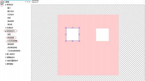
Figure6.5 Add a multi-group button and a multi-state multi-group button
2. Adjust the position and size of each control, and set its image replacement (Note: the multi-group button is in automatic mode, and the multi-state multi-group button is in humidification mode), as shown in Figure 6.6.
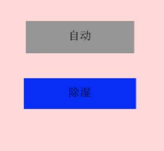
Figure6.6 Adjust position, size, and image replacement
3. Select the multi-group button control, add and set two events, both triggered by clicking. The handling methods and target variables for the two events are shown in Figure 6.7.
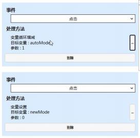
Figure6.7 Event settings for multiple sets of buttons
4. Set variable bindings for multiple sets of buttons. The bound control properties include image index, data source binding, and conversion mode settings, as shown in Figure 6.8.
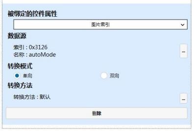
Figure6.8 Variable bindings for multiple sets of buttons
newmode variable:

Automode variable:

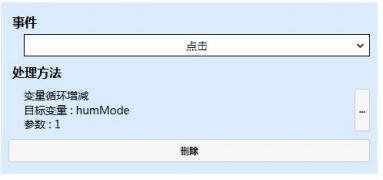
5. Select the three-state multiple button control and add an event. The event trigger is click. The event handling method and parameter settings are as shown in Figure 6.9.
6.9 Event settings for three-state multiple buttons
6. Add variable bindings for two three-state multiple buttons. The bound control properties, data sources, and conversion modes for the two variables are set as shown in Figure 6.10.
Note: The invalid state setting requires variable binding for the three-state multiple buttons. The bound control property is operation enable, and the data source, conversion mode, conversion method, and conversion parameter settings refer to Figure 6.10. The value of the automode variable is compared with 0. When it is false, the three-state multiple buttons are in the disabled state, which is the invalid state. When it is true, the three-state multiple buttons are in the enabled state.
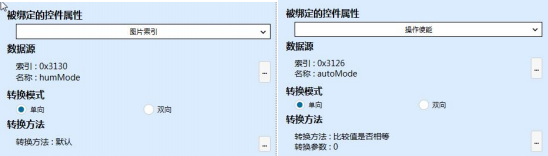
Figure6.10 Variable bindings for three-state multiple buttons
7. During simulation demonstration, click the humidification button to enable the humidification mode; click the automatic mode button, and the humidification button is in the invalid state, as shown in Figures 6.11 and 6.12.
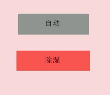
Figure6.11 Click the humidification button
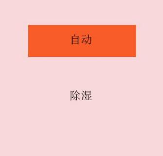
Figure6.12 Click on "Auto Mode"
7. Multiple Groups of Radio Buttons Application
7.1 Control Introduction
The multiple groups of radio buttons control function similarly to multiple groups of buttons, incorporating both the functionality of radio buttons and the ability to display different states through images. It can be understood as multiple sets of switches. When the data attribute bound to the variable is an image index, the switch image for that group will be called based on the bound value, achieving the effect of autonomous switching of switch images. At the same time, this control can display the display effects of different states when pressed or released.
7.2 How to Replace Images
Select the multiple groups of radio buttons control, click on the property window on the right, and modify the images for the multiple groups of radio buttons. The operation steps are shown in Figure 7.1.
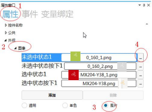
Figure7.1 Image Replacement
Unselected State 1, which is the state displayed when the multiple groups of radio buttons are not operated;
Unselected State Pressed 1, which is the state displayed when the multiple groups of radio buttons are pressed from the unselected state;
Selected State 1, which is the state displayed when the multiple groups of radio buttons are pressed;
Selected State Pressed 1, which is the state displayed when the multiple groups of radio buttons are pressed from the selected state.
During simulation, when the multiple groups of radio buttons are not operated, they display the unselected state 1, as shown in Figure 7.2.
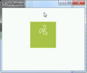
Figure7.2 Unselected state1
When multiple sets of radio buttons are pressed from the unselected state, it displays the unselected state pressed 1, as shown in Figure 7.3.
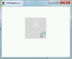
Figure7.3 Unselected state pressed1
When multiple sets of radio buttons are pressed, it displays the selected state 1, as shown in Figure 7.4.
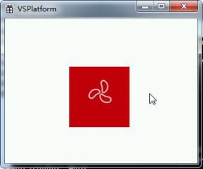
Figure7.4 Selected state1
When multiple sets of radio buttons are pressed from the selected state, it displays the selected state pressed 1, as shown in Figure 7.5.
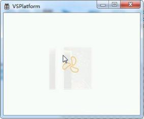
Picture7.5 Selected state pressed1
7.3 Application case
7.3.1Event list
The event list is described in the following table:
|
Control initialization |
The "radio button" triggers an event when it is initialized |
|
Control destruction |
Event triggered when the "Radio Button" is destroyed |
|
Touch screen press |
Event triggered when the "Radio Button" is pressed (not yet completed, only pressed) |
|
Selected |
Event triggered when the "Radio Control" is in the selected state |
|
Not selected |
Event triggered when the "Radio Control" is in the unselected state |
Protocol-related operations are similar to those of button controls and will not be repeated.
7.3.2How to dynamically switch different images using multiple sets of radio buttons
Click the desired different mode button (button control), and the corresponding mode start button (multiple sets of radio button control) displays the selected corresponding mode image. Click the mode start button to activate that mode.
Operation steps
1. Open or create a new project, add three button controls and one multi-group radio button, as shown in Figure 7.6.
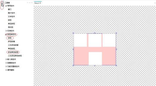
Figure7.6 Add controls
2. Adjust and set the size and position of the controls, and replace their images, as shown in Figure 7.7.
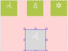
Figure7.7 Adjust the position and size of controls and replace their images
3. Select the button controls, add one event for each, and set the trigger for all three events to "Click". Set the handling method, target variable, and other parameters, as shown in Figure 7.8.
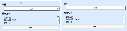
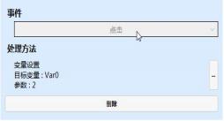
Figure7.8 Button control event settings
4. Set variable bindings for the two multi-group radio buttons. The settings for the two variable bindings are shown in Figure 7.9.
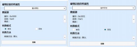
Figure7.9 Variable bindings for multi-group radio buttons
The Var0 and Var1 variables are:

5. During the simulation demonstration, when the air supply mode is clicked, the multi-group radio buttons display the image of the air supply mode. Clicking and selecting the multi-group radio buttons enables the air supply mode;
when the dehumidification mode is clicked, the multi-group radio buttons display the image of the dehumidification mode. Clicking and selecting the multi-group radio buttons enables the dehumidification mode;
when the cooling mode is clicked, the multi-group radio buttons display the image of the cooling mode. Clicking and selecting the multi-group radio buttons enables the cooling mode, as shown in Figures 7.10, 7.11, and 7.12.
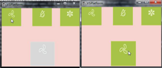
Figure7.10 Enable Air Supply Mode
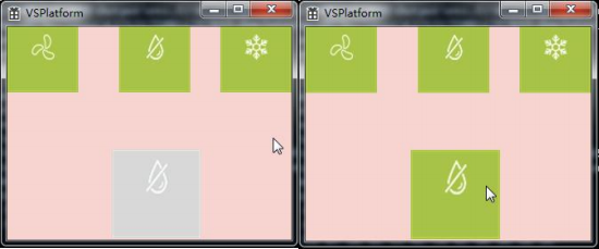
Figure7.11 Enable Dehumidification Mode
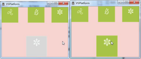
Figure7.12 Enable Cooling Mode
8. Three-State Multi-Group Radio Button Application
8.1 Control Introduction
The three-state multi-group radio button control is compatible with the multi-group radio button function and also adds an invalid state display function,allowing the button to be set in an invalid state (non-usable state).
8.2 How to Replace Images
Select the three-state multi-group radio button,click the property window on the right to modify the image of the three-state multi-group radio button. The operation steps are shown in Figure 8.1.
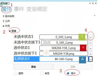
Figure8.1 Image Replacement
Unselected State 1: The state displayed when the three-state multi-group radio button is not operated;
Unselected State 1: The state displayed when the three-state multi-group radio button is pressed from the unselected state;
Selected State 1: The state displayed when the three-state multi-group radio button is pressed;
Selected State 1: The state displayed when the three-state multi-group radio button is pressed from the selected state;
Invalid State 1: The state displayed when the three-state multi-group radio button is not enabled.
During simulation, when the three-state multi-group radio button is not operated, it displays the unselected state 1, as shown in Figure 8.2.
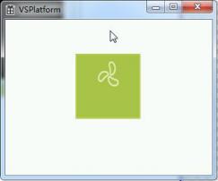
Figure8.2 Unselected State1
The three-state multi-group radio button displays the unselected state pressed 1 when pressed from the unselected state, as shown in Figure 8.3.
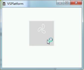
Figure8.3 Unselected State Pressed1
The three-state multi-group radio button displays the selected state 1 when pressed, as shown in Figure 8.4.
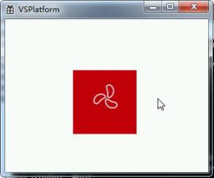
Figure8.4 Selected State1
The three-state multi-group radio button displays the selected state pressed 1 when pressed from the selected state, as shown in Figure 8.5.
Figure8.5 Selected State Pressed1
The invalid state is the state displayed when the three-state multi-group radio button is disabled.
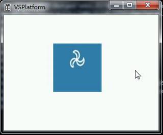
Picture8.6 Invalid state
8.3 Event List
The event list is described in the following table:
|
Control Initialization |
Event triggered when the "Radio Button" is initialized |
|
Control Destruction |
Event triggered when the "Radio Button" is destroyed |
|
Touch Press |
Event triggered when the "Radio Button" is pressed (not yet completed clicking, only pressed) |
|
Selected |
Event triggered when the "Radio Button" is in the selected state |
|
When |
"Single Choice Control" is not selected, the event |
is triggered. The protocol-related operations are similar to those of button controls and will not be repeated here.


Leave a Reply