
What is a progress bar control?
A progress bar control can visually reflect the changing effect of certain numerical values on the screen, and can be used in conjunction with text controls, slider controls, and button controls.
This routine introduces the properties and common applications of the progress bar control, and combines the screen in engineering to introduce the configuration of each application. Common applications are as follows:
- Boot progress bar: The MCU sends data to the screen at regular intervals during startup, resulting in the automatic increase of the progress bar on the screen.
- Control linkage: Realizes the data linkage update among the progress bar, slider, and text control.
- Incremental adjustment: By associating the button control with the progress bar control, the progress bar can be increased or decreased through the button.
Scope of application: Full series.
Routine download link: "Serial port screen progress bar control application"(click to jump)
3.1. Progress bar control properties
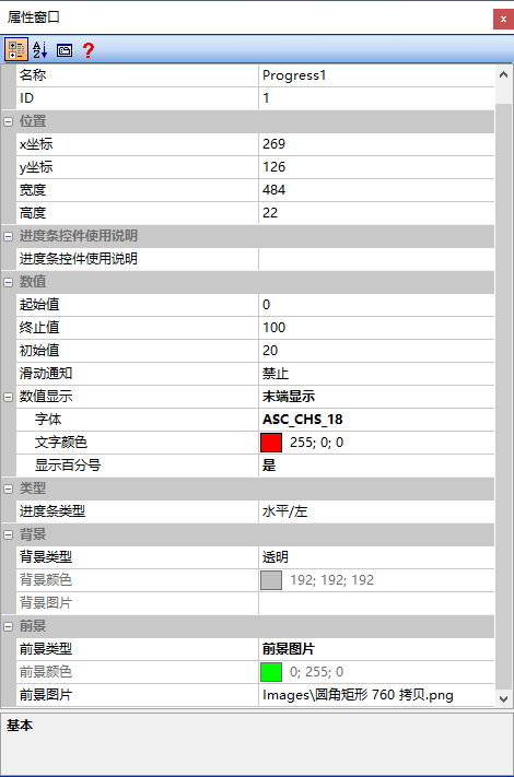
Starting value
Starting position of the progress bar control display range
End value
End position of the progress bar control display range
Initial value
Position indicated by the progress bar at initialization
Sliding notification
It can be set to "Prohibit", "Allow [Slide to Notify]", "Allow [Release to Notify]", or "Associate with Slider", as shown below
- Disabled: Set the progress bar to be disabled for sliding
- Allow [Slide Notification]: Set the progress bar to be slidable, and send notification data while sliding
- Allow [Release Notification]: Set the progress bar to be slidable, and send notification data when it is released
- Associated with slider: Set to be associated with the slider control, allowing the progress bar value to be changed by dragging the cursor
Numerical display
Set the display method of the progress bar's numerical value, which can be set to "Do not display", "Display centered", or "Display at the end", as shown below
- Font: Set the font size of the progress bar's displayed numerical value
- Text color: Set the text color of the progress bar's displayed numerical value
- Display percentage: Set whether the progress bar's numerical value is displayed in the form of a percentage, which can be set to "Yes" or "No"
Progress bar type
Set the direction in which the progress bar is displayed within the control range, which can be set to "Horizontal/Left", "Horizontal/Right", "Vertical/Up", or "Vertical/Down"
Background type
Set the type of the progress bar's background, which can be set to "Transparent", "Monochrome background", or "Background image"
- Background color: When the "Background Type" is set to "Single Color Background", the background color can be set through the color palette
- Background image: When the "Background type" is set to "Background image", the background of the progress bar can be set by inserting an image UI here
Foreground type
Set the foreground type of the progress bar, which can be set to "Monochrome foreground" or "Foreground image"
- Foreground color: When the "Foreground Type" is set to "Monochrome Foreground", the foreground color can be set through the color palette
- Foreground image: When the "Foreground type" is set to "Foreground image", the foreground of the progress bar can be set by inserting an image UI here
3.2 Boot Progress Bar Application
When the screen is powered on, the progress bar control can be used to incrementally display according to a certain step value, enhancing the user experience.
Screen Configuration
[Progress Bar Function] Import the corresponding artwork image as the "background image" of the screen
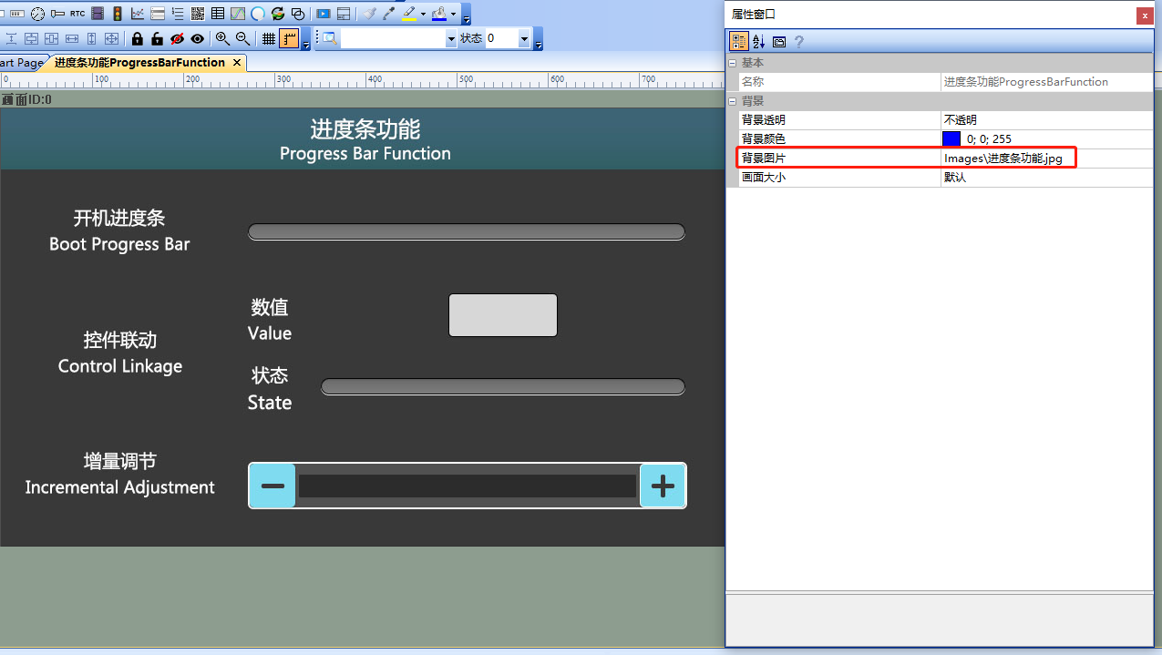
Attribute Configuration
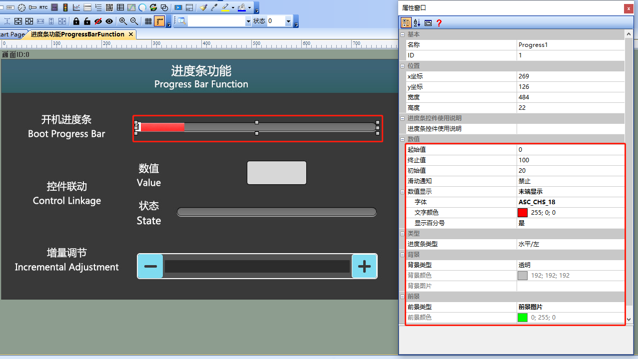
Set the "Value Display" to "End Display" with "Display Percentage", set the "Background Type" to "Transparent", set the "Foreground Type" to "Foreground Image", and insert the prepared UI image in the "Foreground Image" field. The configuration is as follows:
Run Preview
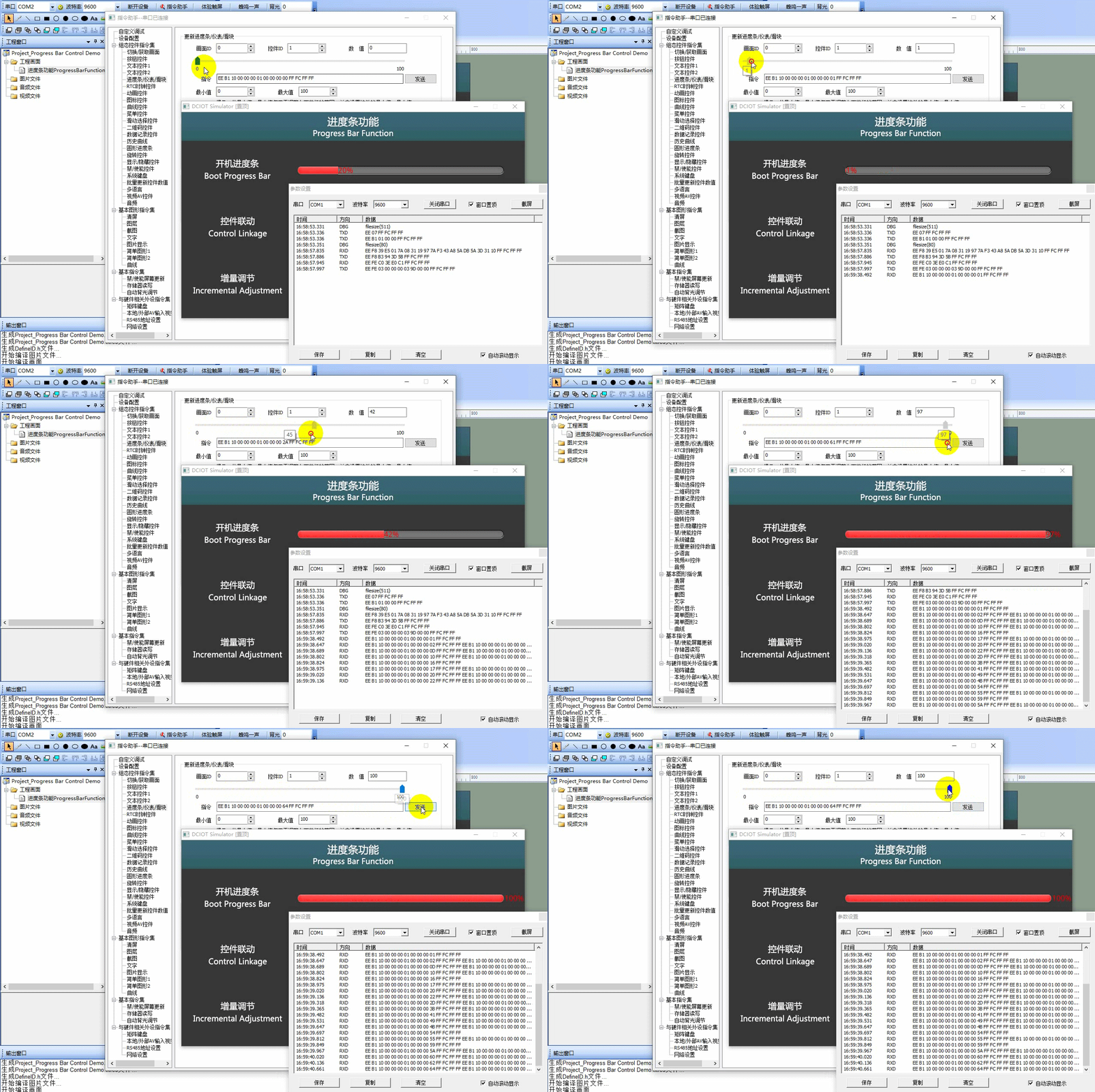
Establish a connection between the virtual screen and VisualTFT. In the 'Command Assistant' ⇨ 'Progress Bar/Gauge/Slider', drag the progress to simulate the boot progress, as shown below
External MCU Control
Refer to the function declarations in the him.dever.h file and the definitions in the him.dever.c file in the Keil development package. For example, if the user needs to implement the effect of the "boot progress bar" (the progress bar increases in cycles from [0-100]) in the routine, they can directly call the progress bar control value update function SetProgressValue() as shown in the code below
/************************************************************************
** Function name:    void SetProgressValue (uint16 screen_id,
**                                          uint16 control_id,
**                                          uint32 value);
** Descriptions    :  设置进度条控件值
** input parameters:
**                    screen_id : 画面ID
**                    control_id: 控件ID
**                    value     : 设置的数值
** output parameters : 无
** Returned value    : 无
************************************************************************/
uint8 Start_Progress = 0;

/*!
* brief 更新开机进度条值
*/
void UpdateUI()
{
    if(current_screen_id == 0)
    {
        Start_Progress += 1;
        if(Start_Progress > 100)
        {
            Start_Progress = 0;
        }
        SetProgressValue(0, 1, Start_Progress);//设置画面0,ID1进度条控件值
    }
}
3.3 Control Linkage Application
Attribute Configuration
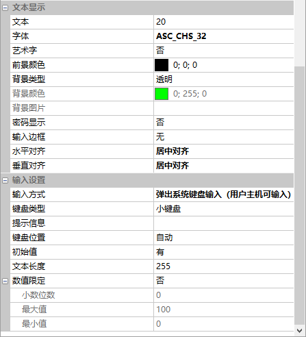
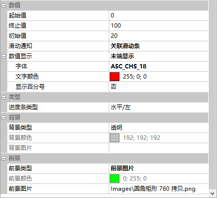
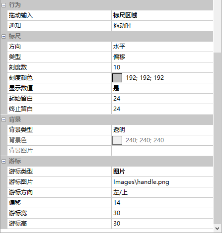
The attributes of text control, progress bar control, and slider control are as follows:
Text Control Attributes
Progress Bar Control Attributes
Slider Control Attributes
External MCU Control
For example, when the user needs to implement a slider control with a range of [0-100], and the cursor is slid to the position of "88", the values of the progress bar and text control should be updated simultaneously to "88". Or when using the pop-up keyboard to input text, the value of the progress bar should be updated as the text value changes. Simply call the progress bar control notification function NotifyProgress() and the text control notification function NotifyText() as shown in the code below
/************************************************************************
** Function name:    void NotifyProgress (uint16 screen_id,
**                                        uint16 control_id,
**                                        uint32 value);
** Descriptions    : 设置进度条控件通知
** input parameters:
**             screen_id: 画面ID
**            control_id: 控件ID
**                 value: 进度条控件值
** output parameters: 无
** Returned value   : 无
************************************************************************/
void NotifyProgress(uint16 screen_id, uint16 control_id, uint32 value)
{
    if(screen_id == 0 && control_id == 3)
    {
        SetTextInt32(0,2,value,0,1);//关联进度条的值赋值给画面0,ID2的文本控件
    }
}
/************************************************************************
** Function name:    void NotifyText (uint16 screen_id,
**                                    uint16 control_id,
**                                    uint8 *str);
** Descriptions    : 设置文本控件通知
** input parameters:
**              screen_id: 画面ID
**             control_id: 控件ID
**                    str: 文本控件内容
** output parameters: 无
** Returned value   : 无
************************************************************************/
void NotifyText(uint16 screen_id, uint16 control_id, uint8 *str)
{
    int32 value = 0;
    if(screen_id == 0 && control_id == 2)
    {
        sscanf(str,"%ld",&value);//字符转化为整数
        SetProgressValue(0,3,value);//文本控件数值赋值给画面0,ID3的进度条控件
    }
}
3.4 Progress Bar Progress Adjustment
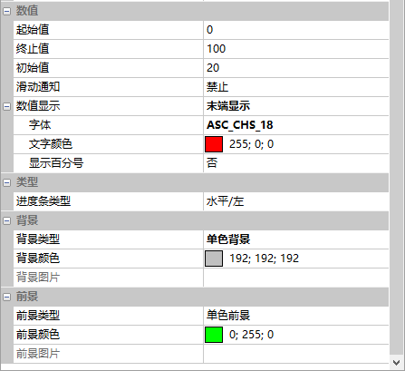
The attributes of progress bar control and button are as follows
Text Control Attributes
Progress Bar Control Attributes
External MCU control
For example, the user can set the value of the progress bar by calling the function SetProgressValue() as shown below
/************************************************************************
** Function name:    void SetProgressValue (uint16 screen_id,
**                                          uint16 control_id,
**                                          uint32 value);
** Descriptions    :  设置进度条控件值
** input parameters:
**                    screen_id : 画面ID
**                    control_id: 控件ID
**                    value     : 设置的数值
** output parameters : 无
** Returned value    : 无
************************************************************************/

{
    ......
    SetProgressValue(0, 1, Start_Progress);//设置画面0,ID1进度条控件值
    ......
}

Leave a Reply