前の記事
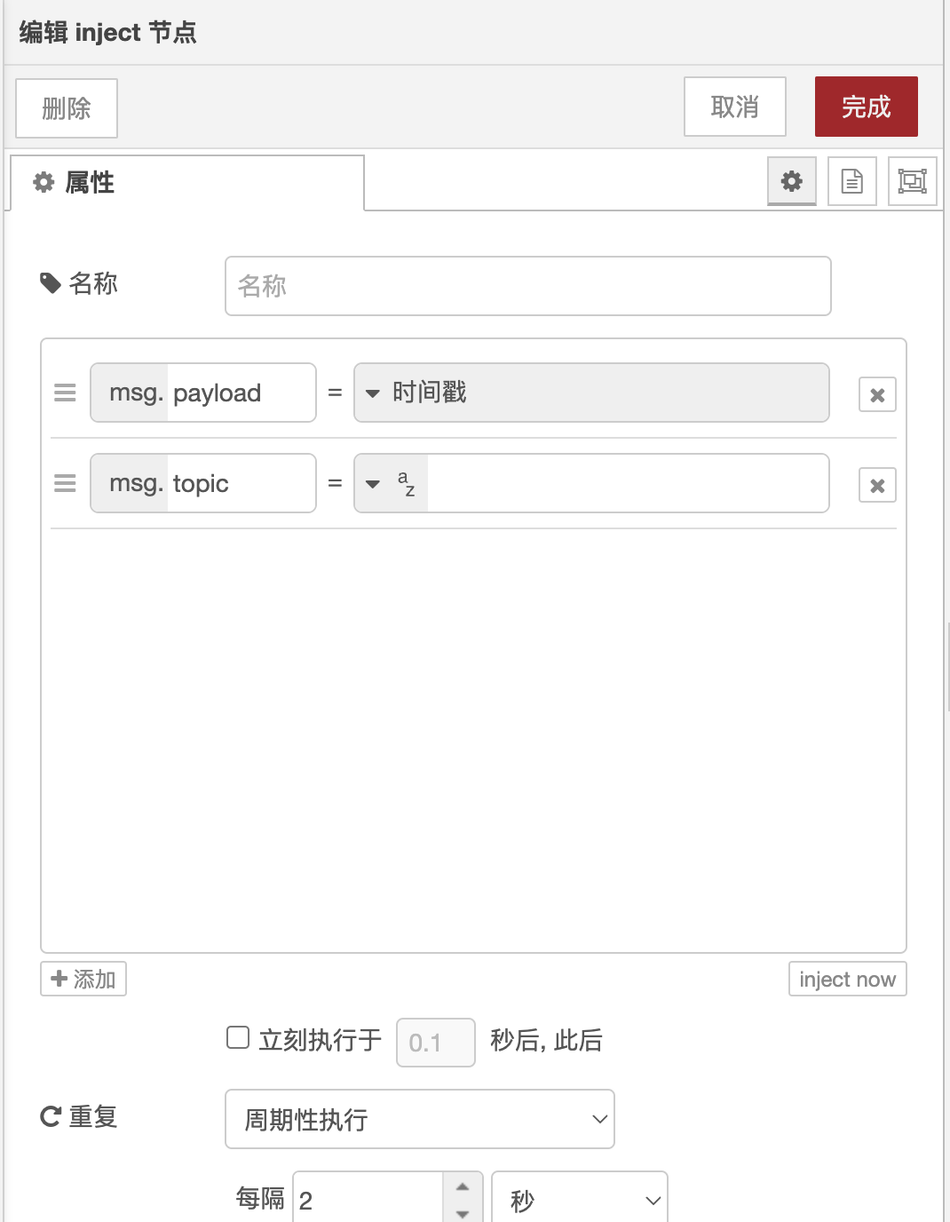
最近、ブログを通じて読者からnode-redノードをカスタマイズする際に、ノードの構成ページを書く方法について相談を受けました。これは、通常2つのノードが開いている情報ポップアップウィンドウです。下の写真は
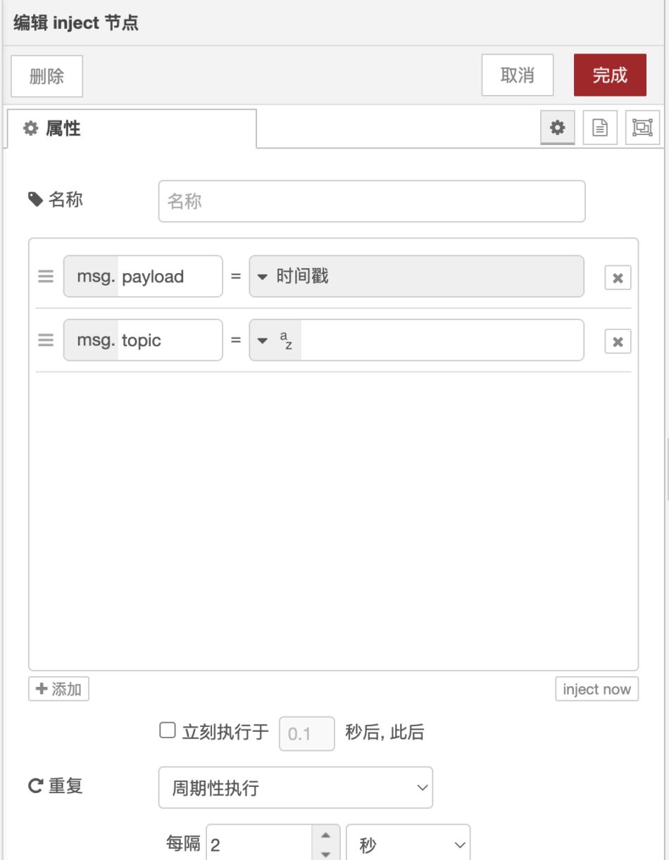
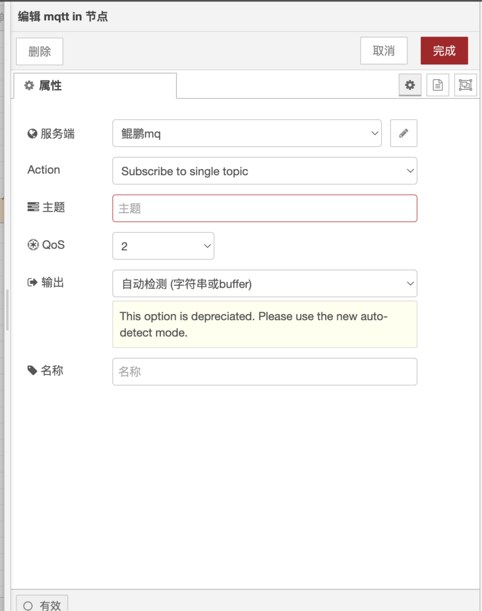
上の2つの図は、injectノードとmqtt inノードの設定ポップアップウィンドウを示しています。
ポップアップウィンドウでは、上の削除、キャンセル、完了、下の無効ボタンに加えて。
中間部分は開発者自身が書く必要がある。
必要なボタン、必要な入力ボックス、およびテキストフィールド。
ノード構成ポップアップウィンドウは、ユーザー構成とノード構成データの変更の主な方法です。
以下は、このページの作成方法を示します。
このウィンドウはHTMLファイルに記述され、
<script type="text/html" data-template-name="node-type">
    <!-- edit dialog content  -->
</script>
scriptタグのtypeプロパティはtext/htmlに設定する必要があり、エディタがjs構文を強調表示するのに役立ちます。
ラベルにはdata-template-name属性も含める必要があります。これは、スクリプトが適用されるノード型を示します。
ここでHTMLを書くことができます
以下は以下の通り。
<div class="form-row">
    <label for="node-input-name"><i class="fa fa-tag"></i> Name</label>
    <input type="text" id="node-input-name" placeholder="Name">
</div>
上記は名前を入力するための入力ボックスです。form-rowのように、形式的に直接使用できるクラスもあります。これは、行ごとに情報を表示するブロックレベル要素を作成するのに役立ちます。
開発者自身がCSSやHTMLを書くことに加えて、Node-Redは標準コンポーネントも提供しています。
ノード設定ポップアップウィンドウを書くためにそれらを使用すると、より美しく、ミニマルで、node-redの全体的なスタイルによく沿っています。
以下をご覧ください。
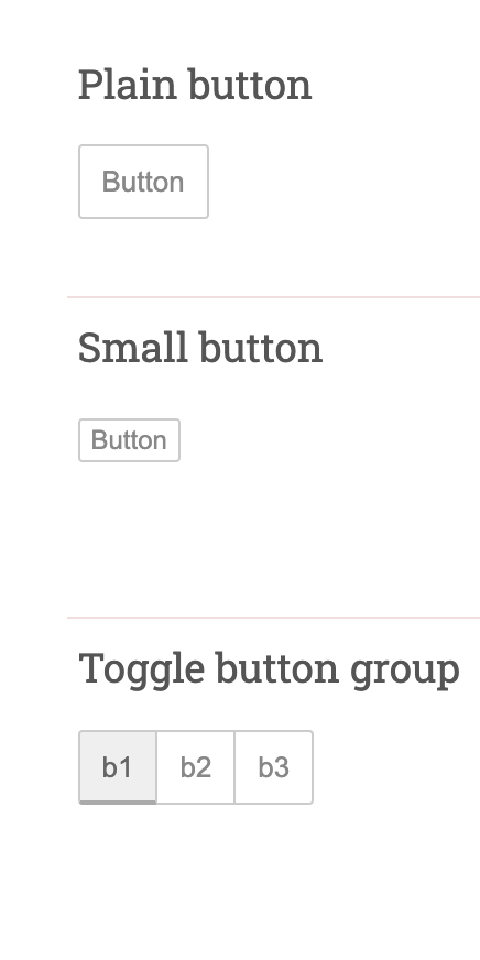
ボタンを押す。
ボタンが頻繁に使用されるため、すべての公式はボタンコンポーネントの標準セットを提供しています。
このように使えます
<button type="button" class="red-ui-button">Button</button>
<button type="button" class="red-ui-button red-ui-button-small">Button</button>
<span class="button-group">
<button type="button" class="red-ui-button toggle selected my-button-group">b1</button><button type="button" class="red-ui-button toggle my-button-group">b2</button><button type="button" class="red-ui-button toggle my-button-group">b3</button>
</span>
上记コードの表示ボタン
入力ボックス。
入力ボックスを使用する場合は、公式のケースをご覧ください。
Plain HTML Input
<input type="text" id="node-input-name">

TypedInput
String/Number/Boolean
<input type="text" id="node-input-example1">
<input type="hidden" id="node-input-example1-type">

TypedInput
JSON
<input type="text" id="node-input-example2">

TypedInput
msg/flow/global
<input type="text" id="node-input-example3">
<input type="hidden" id="node-input-example3-type">
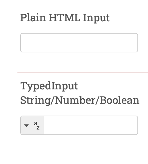
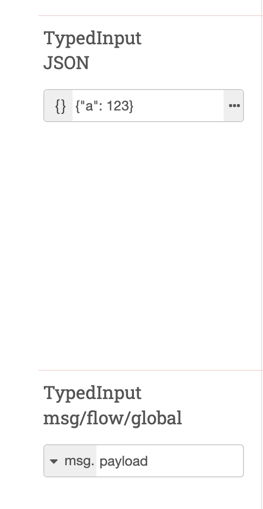
選択ボックスを使用する場合
<input type="text" id="node-input-example5">
$("#node-input-example5").typedInput({
    types: [
        {
            value: "fruit",
            multiple: "true",
            options: [
                { value: "apple", label: "Apple"},
                { value: "banana", label: "Banana"},
                { value: "cherry", label: "Cherry"},
            ]
        }
    ]
})
このように表示されます。
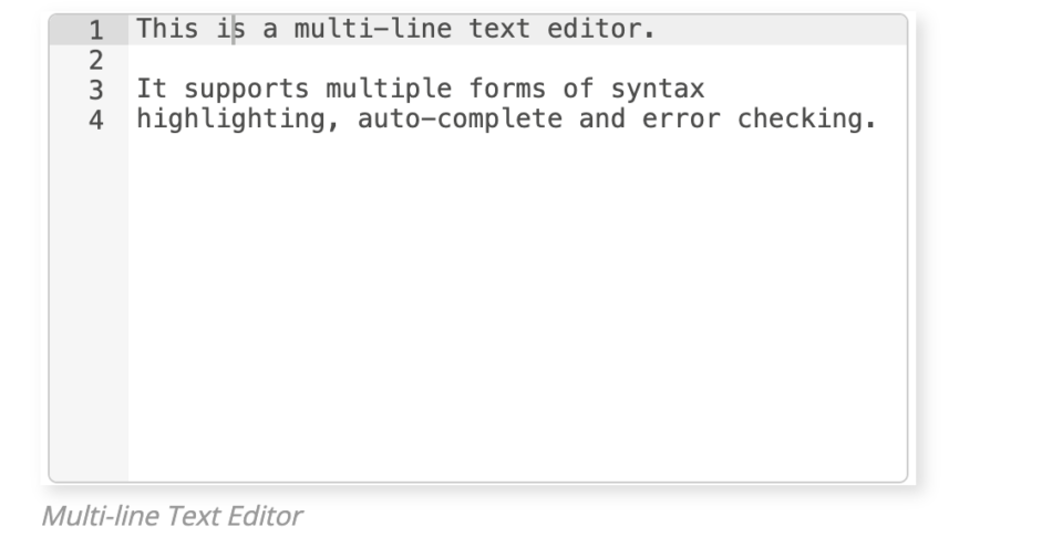
複数行テキストフィールド
node-redの複数行のテキストフィールドは、monacoまたはaceを使用するコードエディタです。
このように使えます
<div style="height: 250px; min-height:150px;" class="node-text-editor" id="node-input-example-editor"></div>
//RED.editor.createEditorメソッドでエディタを作成します。
this.editor = RED.editor.createEditor {
   id 'node-input-example-editor'
   mode 'ace/mode/text'
   value this.exampleText
});
//保存またはキャンセル時に、不要なオブジェクトを破棄し、リソースを解放する
oneditsave function {
this.exampleText = this.editor.getValue;
this. editor.destroy;
編集者を削除する;
},
oneditcancel function {
this. editor.destroy;
編集者を削除する;
},Editor Effectsの略。
概要まとめ
Node-redはカスタムノード機能を提供しており、ニーズに合わせてさまざまなノードを自由に作成できます。
以前、ある読者はNode-Redでライブ会議システムを作りたいと言い、彼らの創造性に感心しました。
より速く、より良い有用なノードを開発するためには、基本的なスキルをよく打つ必要があり、最初に建物の基礎をよく打つ。学びましたか?
Markdown 2920ワード数130行現在行 129,現在列 36記事保存済み18 18 05


请问怎么赋值数据到form里面呢