
The progress bar is a classic visual element: it precisely quantifies the progress of work and can be displayed horizontally/vertically. It supports three effects: solid color, gradient, and texture, with range alarms.
1. Attribute Introduction
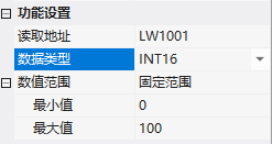
1.1 Function Settings
| Attributes | Description |
|---|---|
| Read Address | Bound Address |
| Data Type | UINT16/INT16/UINT32/INT32/UINT64/INT64/FLOAT/DOUBLE |
| Numerical Range | Fixed Range (Minimum/Maximum Values, must be integers) / Variable Range (Minimum/Maximum Value Addresses) |
1.2 Appearance Settings
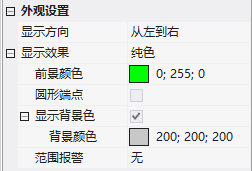
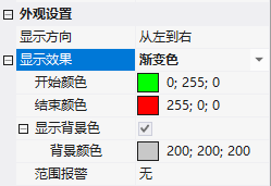
- Display Direction: From Left to Right/From Right to Left/From Bottom to Top/From Top to Bottom
- Display Effect: Pure Color (Foreground Color + Circular Ends + Display Background Color)/Gradient (Start Color + End Color)/Texture (Progress Gallery + Background Gallery)
- Range Alarm: Fixed/Variable Range, Set Alarm Upper and Lower Limit Progress Bar Colors
2. Application Cases
2.1 Fixed Range
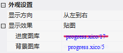
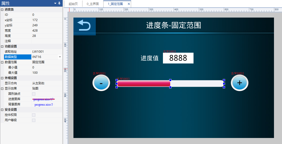
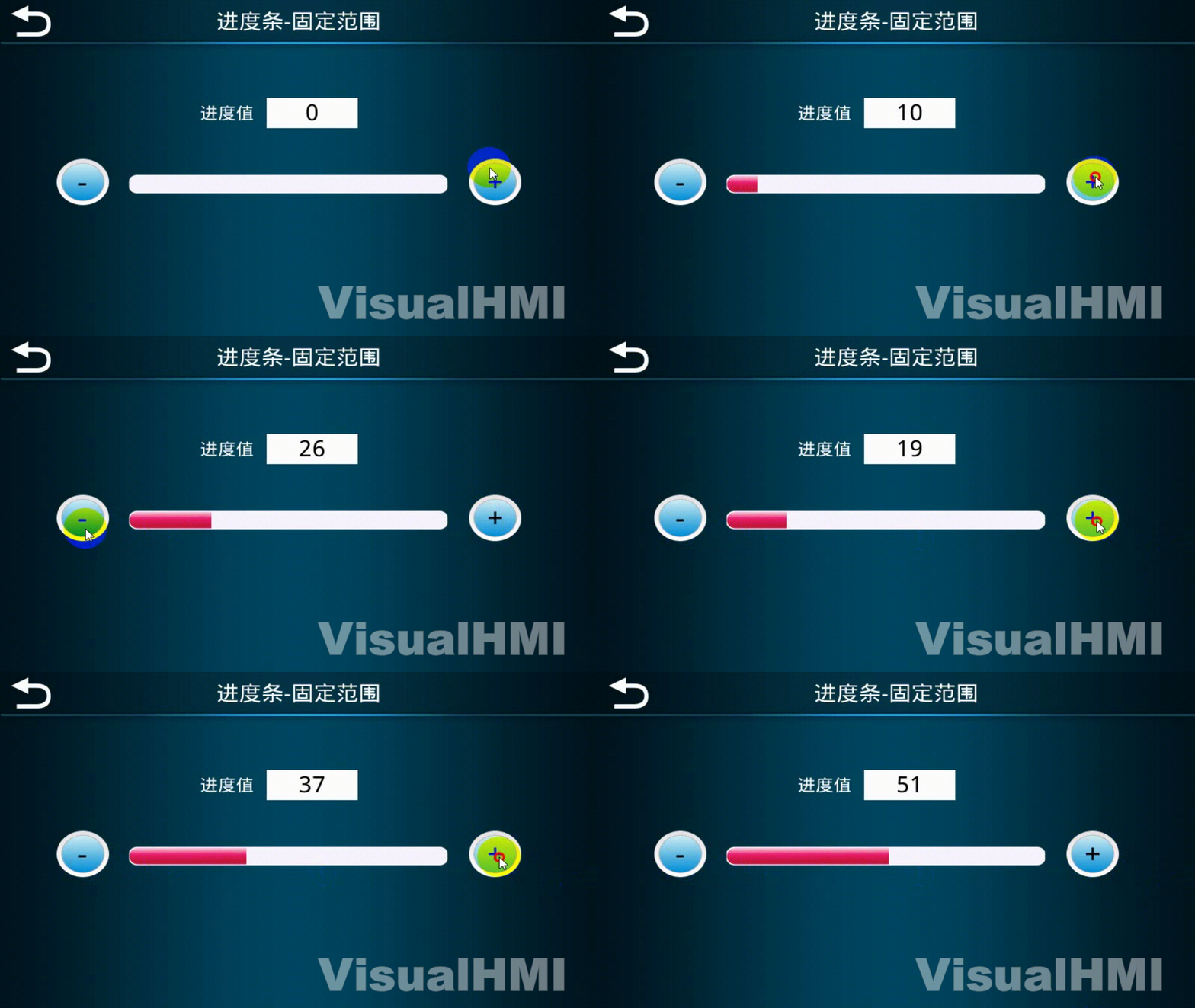
ReadLW1001(INT16), Fixed Range 0~100, Direction From Left to Right, Texture Effect (Progress progress.xico/17, Background progress.xico/5). Button with Text Settings + / - Adjustment, Numerical Limit 0~100.
2.2 Variable Range
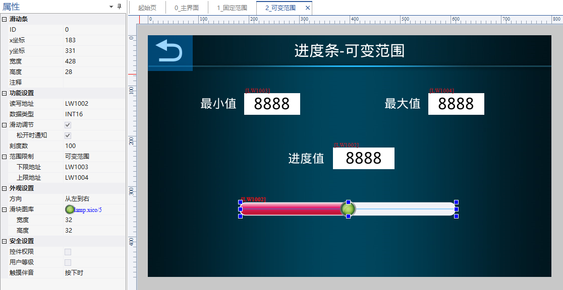
ReadLW1002(INT16), lower limit addressLW1003, upper limit addressLW1004. Set the maximum to 1000 and the minimum to 100. The value changes in real-time as the slider is dragged.
Compiled from the VisualHMI development document of Guangzhou Dacai Technology (hmi-doc.gz-dc.com), the configuration control tutorial "Progress Bar", copyright belongs to Dacai Technology.


Leave a Reply