
1. Introduction to Circular Slider
The circular slider is similar to a slider and can be applied to functions such as temperature, volume, and brightness adjustments. Compared to button controls, it is faster and more intuitive. The difference between a circular slider and a slider lies in their appearance.
2. How to Add a Circular Slider
Open or create a new project file, click on the standard controls in the toolbox, and select the circular slider icon to add a circular slider control in the window, as shown in Figure 2.1.
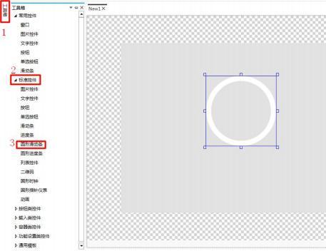 Figure 2.1 Adding a Circular Slider
3. How to Modify the Appearance
Select the slider, click on the property window on the right to modify the image. Click the "Add" button to add a slider display. The base image shows the slider when it is not dragged, and the state image shows the slider after it has been dragged. The slider displays the position where the slider is dragged, as shown in Figure 3.1.
Figure 2.1 Adding a Circular Slider
3. How to Modify the Appearance
Select the slider, click on the property window on the right to modify the image. Click the "Add" button to add a slider display. The base image shows the slider when it is not dragged, and the state image shows the slider after it has been dragged. The slider displays the position where the slider is dragged, as shown in Figure 3.1.
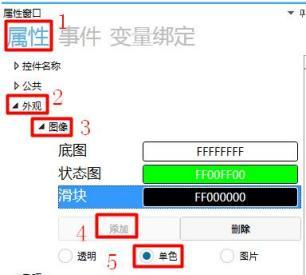 Figure 3.1 Image Replacement
Note: Select monochrome for image display
During simulation, the slider displays the base image and slider when there is no operation, as shown in Figure 3.2.
Figure 3.1 Image Replacement
Note: Select monochrome for image display
During simulation, the slider displays the base image and slider when there is no operation, as shown in Figure 3.2.
 Figure 3.2 Circular Slider Without Operation
Drag the slider, as shown in Figure 3.3.
Figure 3.2 Circular Slider Without Operation
Drag the slider, as shown in Figure 3.3.
 Figure 3.3 Pull the circular slider
 4. How to set miscellaneous items
Click
4. How to set miscellaneous items
Click
 in the property window on the right to set the offset coordinates, maximum and minimum values, direction, and trigger mode of the slider, as shown in Figure 4.1.
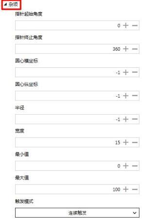 Figure 4.1 Set miscellaneous items
4.1 How to set the pointer offset angle
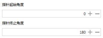
Click the input box under "Pointer start/end angle" to set the pointer start/end angle via the keyboard or the "+" and "-" buttons. Setting the pointer angle means setting the range within which the circular slider can be pulled. The default pointer start angle is 0°, and the default pointer angle is 360°. The pointer can be pulled within this range. When the pointer start angle is 0° and the pointer end angle is 180°, the circular slider displays as 0°-180°, and the slider can only slide within this area
, as shown in Figure 4.2.
Figure 4.1 Set miscellaneous items
4.1 How to set the pointer offset angle
Click the input box under "Pointer start/end angle" to set the pointer start/end angle via the keyboard or the "+" and "-" buttons. Setting the pointer angle means setting the range within which the circular slider can be pulled. The default pointer start angle is 0°, and the default pointer angle is 360°. The pointer can be pulled within this range. When the pointer start angle is 0° and the pointer end angle is 180°, the circular slider displays as 0°-180°, and the slider can only slide within this area
, as shown in Figure 4.2.
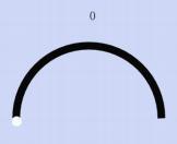 Figure 4.2 Pointer start/end angle
 4.2 How to set the horizontal and vertical coordinates of the circle center
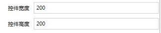
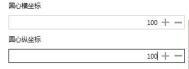
Click the input box for the horizontal and vertical coordinates of the circle center to set the horizontal and vertical coordinates of the circle center via the keyboard or the "+" and "-" buttons. After replacing the base image of the circular slider, if the center of the base image is not at the midpoint, you need to set the horizontal and vertical coordinates of the circle center to find the center. The position of the horizontal and vertical coordinates of the circle center is related to the height and width of the circular slider, and the images of various positions of the circle center are shown in Figure 4.3.
The diagram of various positions around the circle center is shown in Figure 4.3.
4.2 How to set the horizontal and vertical coordinates of the circle center
Click the input box for the horizontal and vertical coordinates of the circle center to set the horizontal and vertical coordinates of the circle center via the keyboard or the "+" and "-" buttons. After replacing the base image of the circular slider, if the center of the base image is not at the midpoint, you need to set the horizontal and vertical coordinates of the circle center to find the center. The position of the horizontal and vertical coordinates of the circle center is related to the height and width of the circular slider, and the images of various positions of the circle center are shown in Figure 4.3.
The diagram of various positions around the circle center is shown in Figure 4.3.
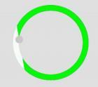 Position of the circle center (0,0)
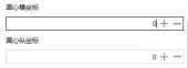
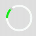 Default position of the circle center
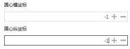
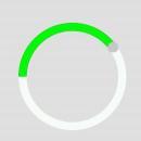 Position of the circle center (100, 100)
 The width and height of the circular slider are
Figure 4.3 X and Y coordinates of the circle center
4.3 How to set the radius
Click the input box under "Radius" to set the radius using the keyboard or the "+" and "-" buttons. Setting the radius means setting the distance from the midpoint of the circular slider to the slider. -1 is the default radius (does not represent any numerical meaning), as shown in Figure 4.4.
The width and height of the circular slider are
Figure 4.3 X and Y coordinates of the circle center
4.3 How to set the radius
Click the input box under "Radius" to set the radius using the keyboard or the "+" and "-" buttons. Setting the radius means setting the distance from the midpoint of the circular slider to the slider. -1 is the default radius (does not represent any numerical meaning), as shown in Figure 4.4.
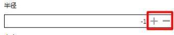 Figure 4.4 Setting the radius
4.4 How to set the width
Click the input box under "Width" to set the width using the keyboard or the "+" and "-" buttons. Setting the width means setting the displayed width of the circular slider, as shown in Figure 4.5.
Figure 4.4 Setting the radius
4.4 How to set the width
Click the input box under "Width" to set the width using the keyboard or the "+" and "-" buttons. Setting the width means setting the displayed width of the circular slider, as shown in Figure 4.5.
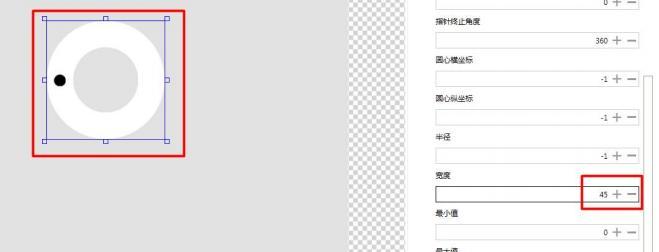 Figure 4.5 Width setting
4.5 How to set the maximum/minimum values
Click the input box under "Max/Min" to set the maximum/minimum value of the slider via the keyboard or the "+", "-" buttons. The default maximum value is 100, and the default minimum value is 0.
Setting the maximum/minimum value sets the maximum and minimum values represented by the slider.
If the minimum value is set to 15 and the maximum value is set to 36, it means that the slider's starting value is 15 and the slider's ending value is 36, as shown in Figure 4.6.
Figure 4.5 Width setting
4.5 How to set the maximum/minimum values
Click the input box under "Max/Min" to set the maximum/minimum value of the slider via the keyboard or the "+", "-" buttons. The default maximum value is 100, and the default minimum value is 0.
Setting the maximum/minimum value sets the maximum and minimum values represented by the slider.
If the minimum value is set to 15 and the maximum value is set to 36, it means that the slider's starting value is 15 and the slider's ending value is 36, as shown in Figure 4.6.
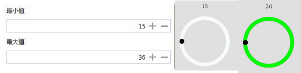 Figure 4.6 Setting maximum/minimum values
Note: The slider needs to be bound to a custom integer variable with a minimum value of 15 and a maximum value of 16.
4.6 How to set the trigger mode
Click the button under the trigger mode to pop up a dropdown box, which includes continuous triggering and triggering upon release. Selecting continuous triggering means that the slider is always triggered when it is dragged. The triggering upon release mode means that the slider is triggered at the moment of release after being dragged, as shown in Figure 4.7.
Figure 4.6 Setting maximum/minimum values
Note: The slider needs to be bound to a custom integer variable with a minimum value of 15 and a maximum value of 16.
4.6 How to set the trigger mode
Click the button under the trigger mode to pop up a dropdown box, which includes continuous triggering and triggering upon release. Selecting continuous triggering means that the slider is always triggered when it is dragged. The triggering upon release mode means that the slider is triggered at the moment of release after being dragged, as shown in Figure 4.7.
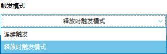 Figure 4.7 Setting the trigger mode
5. Application Cases
5.1 Event List
The event list is explained in the following table:
Figure 4.7 Setting the trigger mode
5. Application Cases
5.1 Event List
The event list is explained in the following table:
5.2 How to send custom protocol commands through the circular slider
1. How to add events
Select the circular slider and click on the events in the property window on the right to add events, as shown in Figure 5.1.
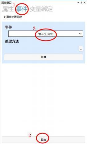 Figure 5.1 Add event
2. How to set processing methods
Custom protocol allows users to use other protocols in the project, such as the Modbus protocol.
Click on the bottom right of the processing method
Figure 5.1 Add event
2. How to set processing methods
Custom protocol allows users to use other protocols in the project, such as the Modbus protocol.
Click on the bottom right of the processing method
 , pop up the processing method window, select "Send Command" → select "Custom Protocol" to send serial port commands → set the command
as shown in Figure 5.2.
, pop up the processing method window, select "Send Command" → select "Custom Protocol" to send serial port commands → set the command
as shown in Figure 5.2.
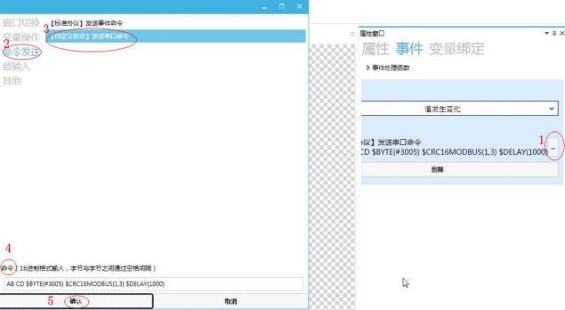 Figure 5.2: Custom Protocol to send serial port commands
Note: When clicking the input box for "Custom Protocol to send serial port commands", a window for custom command function description will pop up, as shown in Figure 5.3.
Figure 5.2: Custom Protocol to send serial port commands
Note: When clicking the input box for "Custom Protocol to send serial port commands", a window for custom command function description will pop up, as shown in Figure 5.3.
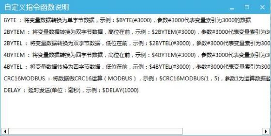 Figure 5.3: Custom Command Function Description Window
3. How to bind variables
Select the slider, click "Variable Binding" in the property window on the right → click "Add" → "Current Value" of the bound control property → "Var0" for data source binding → "Bidirectional" for conversion mode → "Default" for conversion method, as shown in Figure 5.4.
Figure 5.3: Custom Command Function Description Window
3. How to bind variables
Select the slider, click "Variable Binding" in the property window on the right → click "Add" → "Current Value" of the bound control property → "Var0" for data source binding → "Bidirectional" for conversion mode → "Default" for conversion method, as shown in Figure 5.4.
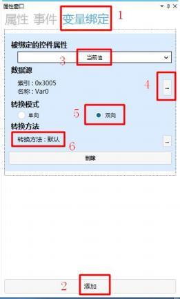 Figure 5.4: Variable Binding
Note: The Var0 variable is
Figure 5.4: Variable Binding
Note: The Var0 variable is
 4. How to view the standard protocol commands sent by the circular slider
When sending a custom protocol command "AB CD $BYTE(#3005) $CRC16MODBUS( 1,3) $DELAY(1000) ", click the simulation run button
4. How to view the standard protocol commands sent by the circular slider
When sending a custom protocol command "AB CD $BYTE(#3005) $CRC16MODBUS( 1,3) $DELAY(1000) ", click the simulation run button
 , slide the circular slider in the simulation interface, and view the sent commands, as shown in Figure 5.5.
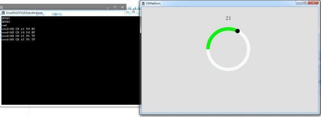 Figure 5.5 Sending [Custom Protocol] Command
5.2 How to Set a Circular Slider Through Custom Parsing
1. How to Add Custom Parsing
Click on the item to pop up the item window, click on Protocol Settings → set the protocol type to "Custom Protocol" → click on Custom Protocol Parsing Settings → pop up the Parsing Settings window → click Add to pop up the Custom Parsing Settings window, set according to the needs and requirements, and you can add a custom protocol parsing, as shown in Figure 5.6.
Figure 5.5 Sending [Custom Protocol] Command
5.2 How to Set a Circular Slider Through Custom Parsing
1. How to Add Custom Parsing
Click on the item to pop up the item window, click on Protocol Settings → set the protocol type to "Custom Protocol" → click on Custom Protocol Parsing Settings → pop up the Parsing Settings window → click Add to pop up the Custom Parsing Settings window, set according to the needs and requirements, and you can add a custom protocol parsing, as shown in Figure 5.6.
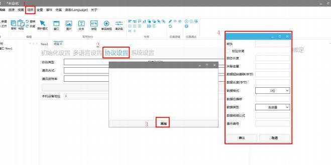 Figure 5.6 Adding Custom Protocol Parsing
2. How to Set Custom Parsing
Set the frame header to "AB CD 00 01" → check the verification frame tail → frame tail "00 01" → total frame length "7" → associated variable index "3005" → data start offset byte "5" → data length (bytes) "1" → data format "1 byte" → data type "continuous quantity" → click "Confirm", as shown in Figure 5.7.
Figure 5.6 Adding Custom Protocol Parsing
2. How to Set Custom Parsing
Set the frame header to "AB CD 00 01" → check the verification frame tail → frame tail "00 01" → total frame length "7" → associated variable index "3005" → data start offset byte "5" → data length (bytes) "1" → data format "1 byte" → data type "continuous quantity" → click "Confirm", as shown in Figure 5.7.
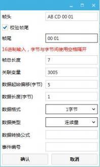 Figure 5.7 Setting Custom Parsing
3. Simulation Debugging
For specific simulation debugging operations and methods, please refer to the "Simulation Debugging User Manual", as shown in Figure 5.8. Send the command "AB CD 00 01 19 00 01" through the serial port debugging tool software, and drag the circular slider to the position of 25
Figure 5.7 Setting Custom Parsing
3. Simulation Debugging
For specific simulation debugging operations and methods, please refer to the "Simulation Debugging User Manual", as shown in Figure 5.8. Send the command "AB CD 00 01 19 00 01" through the serial port debugging tool software, and drag the circular slider to the position of 25
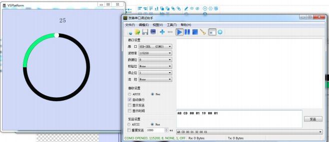 Figure 5.8 Simulation Debugging
|
Control initialization
|
Trigger event when "Circular Slider" is initialized
|
|
Control destroyed
|
Trigger event when "Circular Slider" is destroyed
|
|
Value changes
|
Triggered when "Circular Slider" is slid
|
If you have gained something, please give a thumbs up


Leave a Reply